Damai Entertainment (Alibaba Group)
B2B mobile app for real-time event ticketing data
Context
The Damai ticketing app has an outdated design.
Maikong is a mobile application used by Damai Entertainment to provide events organizers and Damai’s internal team with real-time ticketing data on the events they host. The app currently runs on a years-old design that’s both outdated and hard to use, especially as its use case has expanded. Originally just for on-site ticket verification, Maikong has become the tool to track ticketing progress during events and quickly draw relevant data.
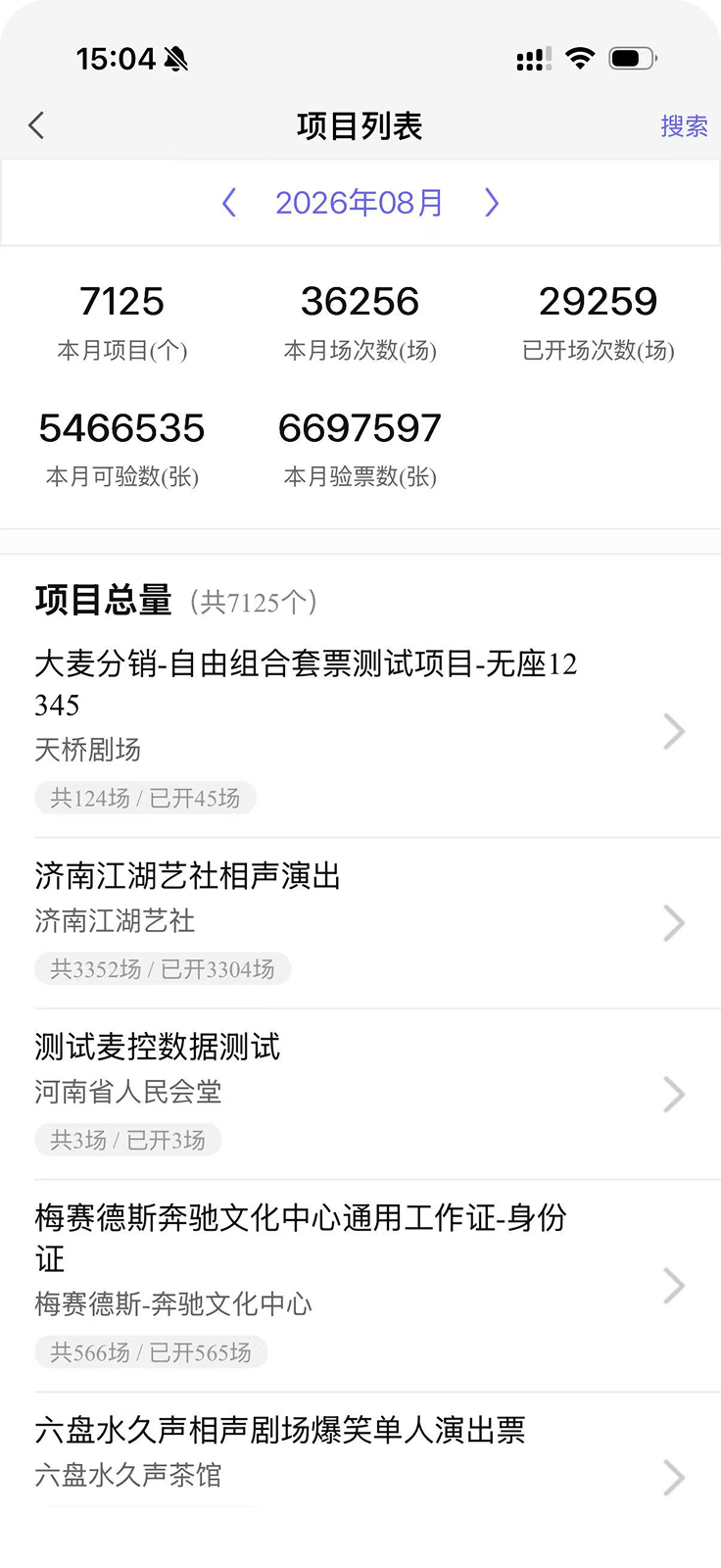
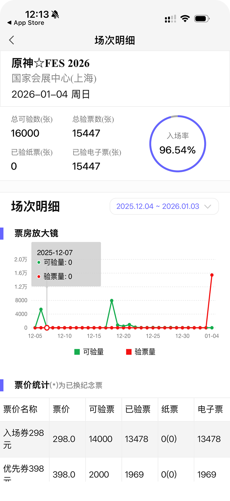
How might we redesign Maikong to help event organizers and Damai’s internal team manage ticketing and event progress?
User groups
After 13 interviews across 2 user groups, I synthesized 4 pain points.
Maikong is used by 2 different user groups with different goals and use cases. Event organizers and Damai’s internal staff also see different contents when they access Maikong, which complicates the design of the app. To accommodate for both user groups, we conducted interviews across both groups and synthesized pain points and needs for both.

Event Organizer
Use Maikong to track ticketing progress across projects.
Can only access one’s own projects.

Damai Internal Staff
Use Maikong to draw relevant data to answer questions from police and organizers.
Can access all projects across Damai.
01
Limited search and filter tools
Screens lack search tools and visual distinction, making data hard to find.
02
Cluttered mobile layout
Dense tables and charts cram the mobile screen, overwhelming users.
Event Organizer
03
Hidden interaction rules
Settings affect what data is shown, without any visual cue to guide users.
Event Organizer
04
Irrelevant information shown
Staff are shown irrelevant statistics and projects that clutter their interface.
Damai Staff
Illustrations are created with Humation on Figma
Concept ideation
I drew low-fidelity wireframes for 4 main interfaces of the redesigned app.
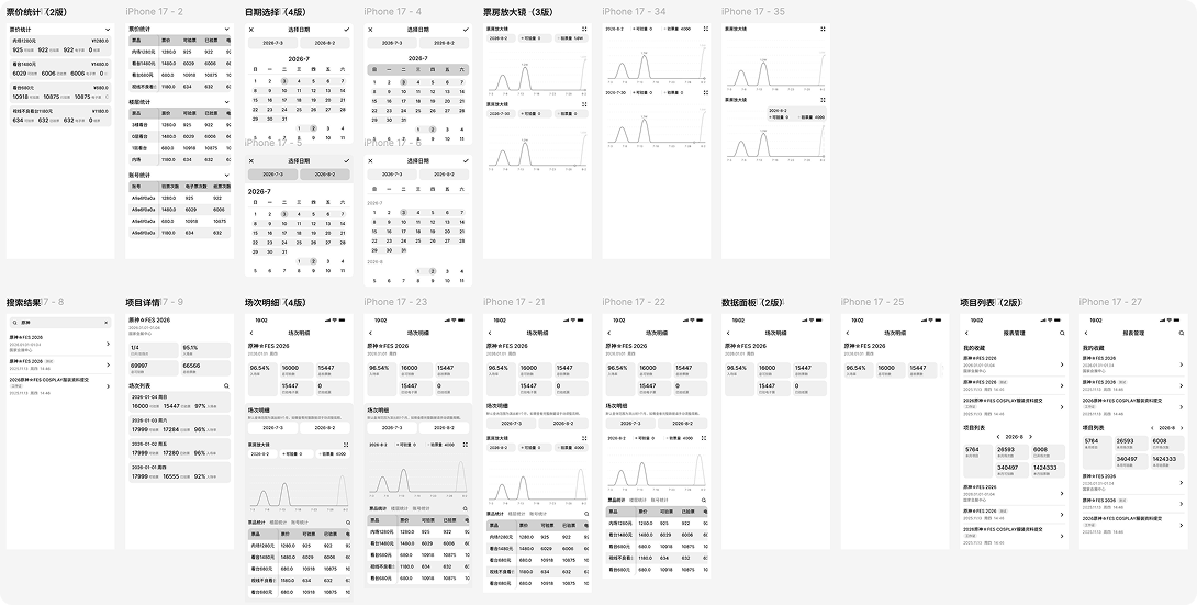
I received feedback to keep the needs of different types of event organizers in mind. Thus, I conducted 5 additional interviews across organizers of concerts, theatre, and exhibitions to summarize the main differences in their needs and goals.
Concerts
Use Maikong for quickly pulling data, not deep analysis.
Events are large-scale, with complex check-in data.
Theatre
Run over a continuous period, not specific days.
Use Maikong to analyze ticket usage trend over time.
Exhibition
Track paper vs. electronic ticket usage since paper tickets are sometimes distributed as souvenirs.
Design decisions
Project Gallery Page
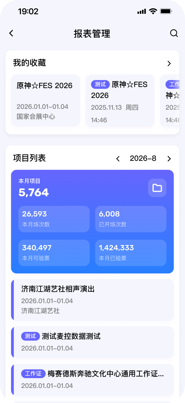
This page provides the user a list of all their projects and an overview dashboard summarizing data such as total sessions and tickets sold.
Current Project Gallery Page
Damai staff see projects irrelevant to them, so they rely on search to find their assigned projects.
04 Irrelevant information shown
Test sessions and actual projects are not visually distinguished.
01 Limited search and filter tools
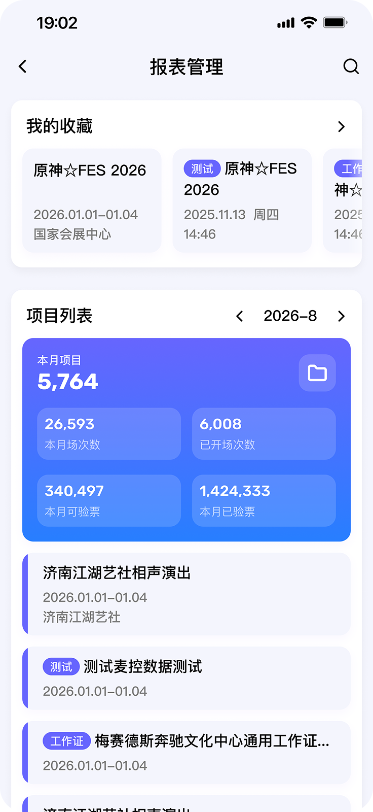
Redesigned Project Gallery Page
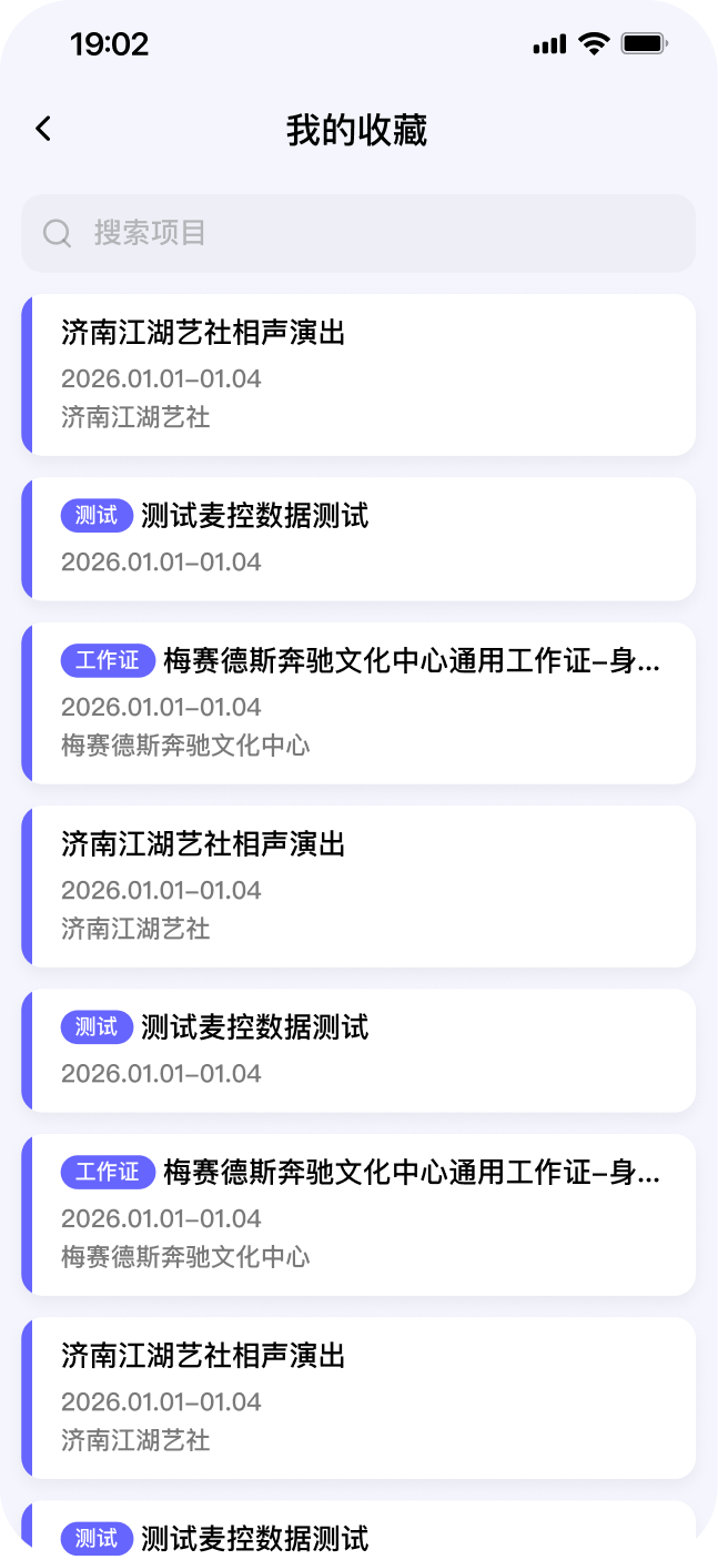
Damai staff can pin relevant projects in the Favorites section for quick access.
04 Irrelevant information shown
Test sessions are distinguished by tags.
01 Limited search and filter tools
Design decisions
Layout Design - Favorited Projects
I designed 2 versions of the Favorites section, and each prioritized the needs of different users.
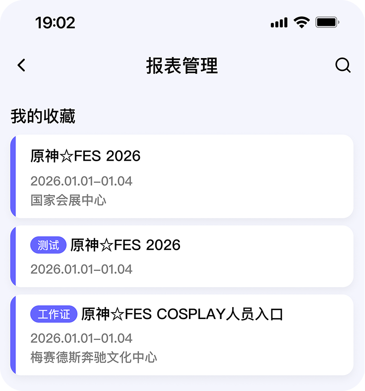
Redesign 1 - Favorites expanded
Damai staff can access pinned projects quickly.
The summary dashboard, can be pushed out of view, but they do not need it.
Event organizers need the summary dashboard.
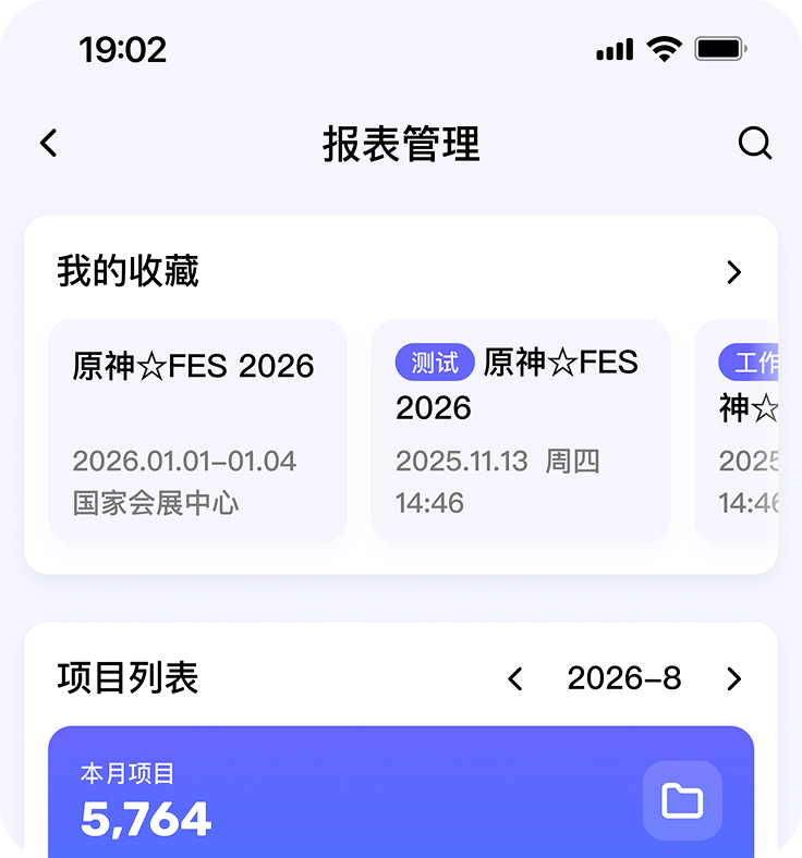
Redesign 2 - Favorites preview
Damai Staff needs an extra click to access the full favorites list.
Event organizers can pin projects without losing view of the dashboard.
Redesign 2 costed Damai staff an extra click, but it’s a better trade-off for organizers — making this our final solution.
Design decisions
Project Details Page
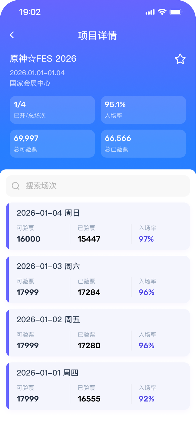
I added a search function so users can quickly find a specific session under an event, especially useful for events with many sessions.
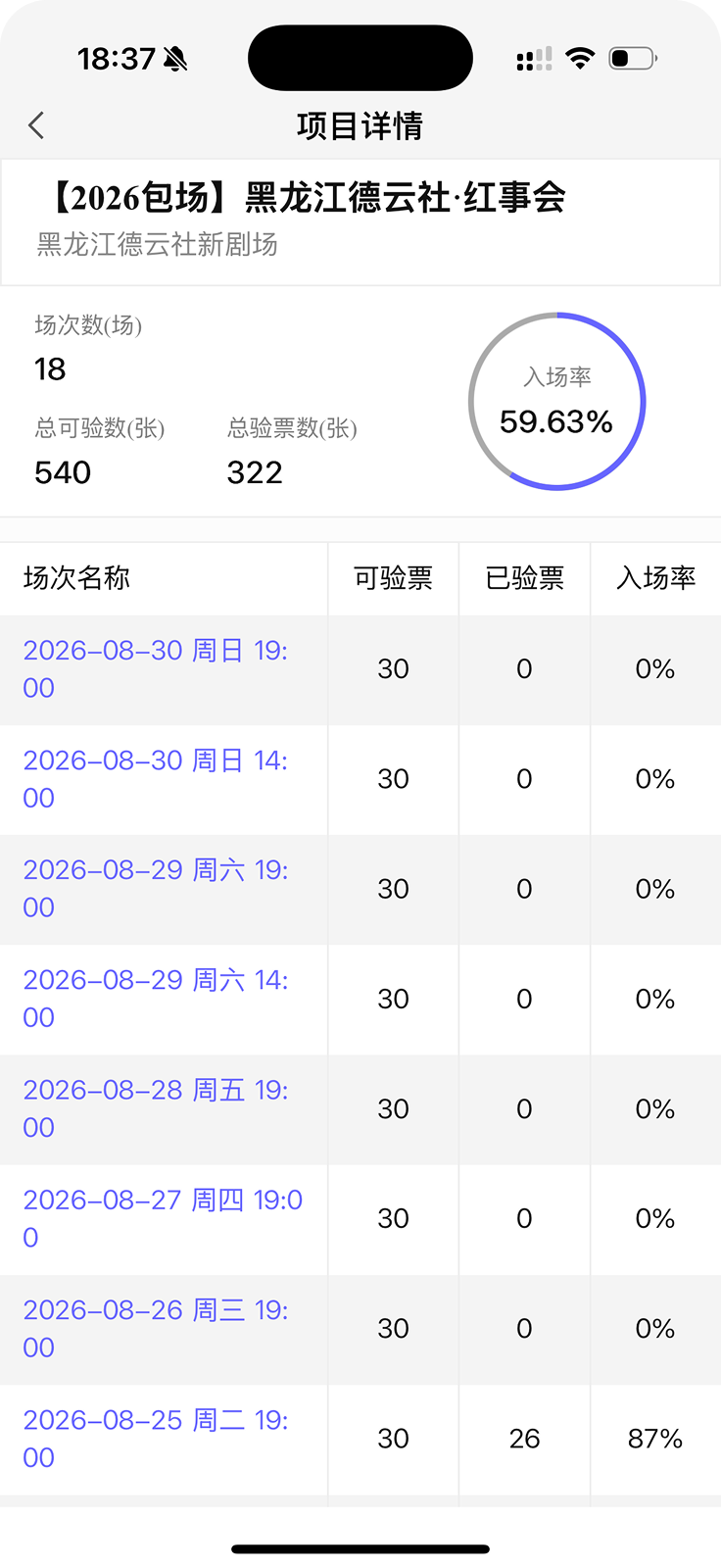
Current project details page
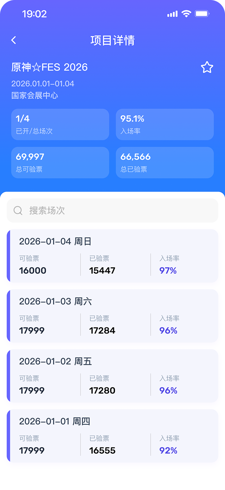
Redesigned project details page
Design decisions
Session Details Page
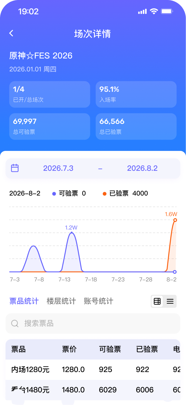
The session details page is where users view detailed ticketing data for a specific session.
Current session details page
Unclear that the date selector affects the charts and tables below
03 Hidden interaction rules
3 tables (each different views of the same data) stacked vertically
02 Cluttered mobile layout
No search tool for data
01 Limited search tools
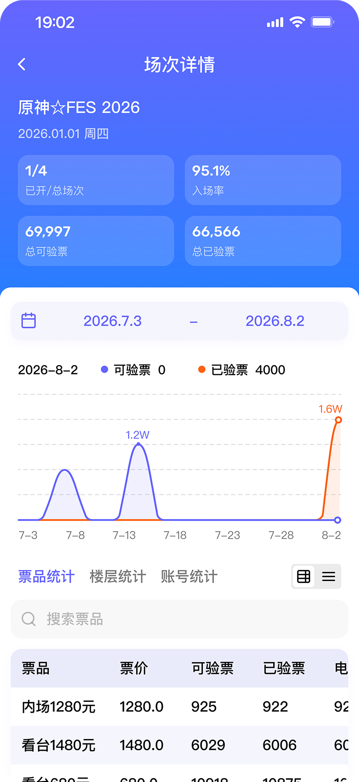
Redesigned session details page
Date selector “grouped” with the charts and tables via background fill and removed subheadings
03 Hidden interaction rules
Uses tabs to switch between tables, saving vertical space
02 Cluttered mobile layout
Added searching tool
01 Limited search tools
Design decisions
Table Design - Ticket Activity By Type
Maikong offers a breakdown of ticketing data (eg. price, amount purchased, amount checked in) for each session of an event. While some users find the table format too cluttered, others liked its efficiency. I had to choose between a table or list layout.
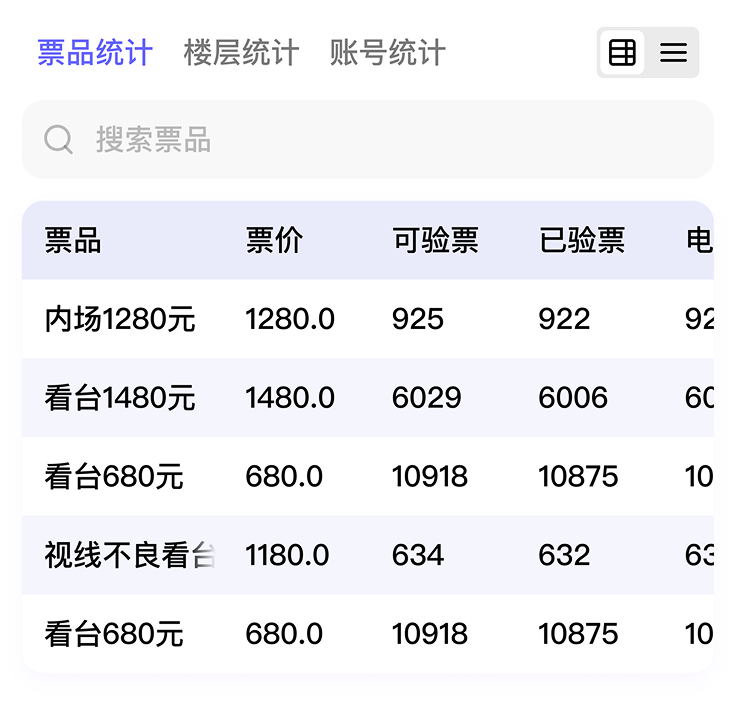
Redesigned - Table layout
Displays data more densely, faster to scan
Easier to compare data across types
Feels overwhelming on mobile
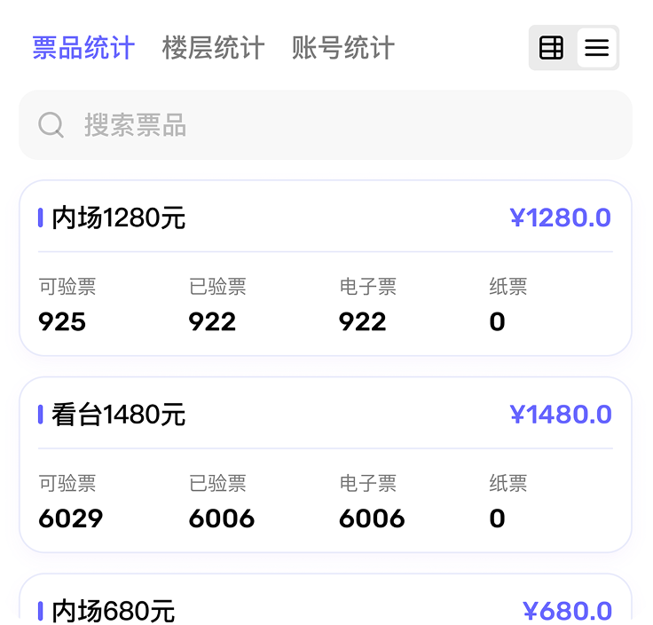
Redesigned - List layout
Clean, mobile-friendly layout that only scrolls vertically
The same content takes up more vertical space
In this case, I added a toggle in the upper-left corner so users can switch between layouts on their own — accommodating both large and small-scale events, since the same organizer may manage both types.
Final designs