
MUJI USA
E-commerce site reimagined as a lifestyle brand destination
Context
MUJI's site needs to be redesigned for younger audiences.
As MUJI's e-commerce grows, younger shoppers need an easier way to explore its huge product catalog. Our team redesigns that experience to feel simple and intuitive, without losing MUJI's minimalist identity.
How might we help MUJI communicate their product offerings to a broader, younger audience through their digital e-commerce platform?
Competitor analysis
After researching 14 competitors, we gathered 3 insights on how they communicate their products.
We researched brands that overlap with MUJI in both product category and lifestyle positioning, analyzing how they communicated products and drove purchase intent in their e-commerce sites and physical stores.








Brand storytelling is important
Communicating where a brand comes from builds the trust that drives purchases.
Clear hierarchies eases browsing
Sites with large catalogs felt most usable when products were presented in a clear structure.
Bridge digital and physical shopping
A brand's identity lives in its physical stores, carrying that online keeps the experience intentional and consistent.
Personas
The Loyal Customer and The Curious Passerby

The Loyal Customer
Shopped multiple times at MUJI before, often in-person. Familiar with MUJI’s brand identity.

The Curious Passerby
Has heard of MUJI from a friend or has passed by a shop before. Unfamiliar with MUJI’s full product catalog.
Illustrations are created with Humation on Figma
User Research
After 14 interviews covering both personas, we identified 5 gaps in the current web experience.
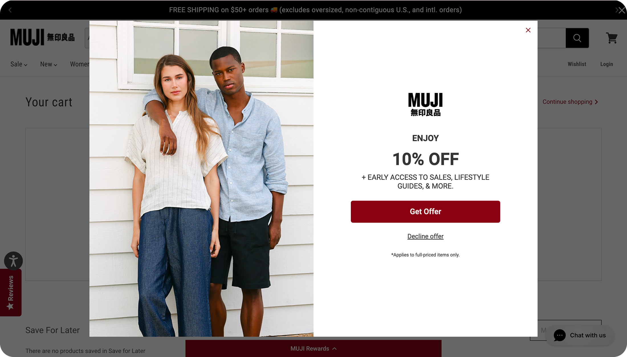
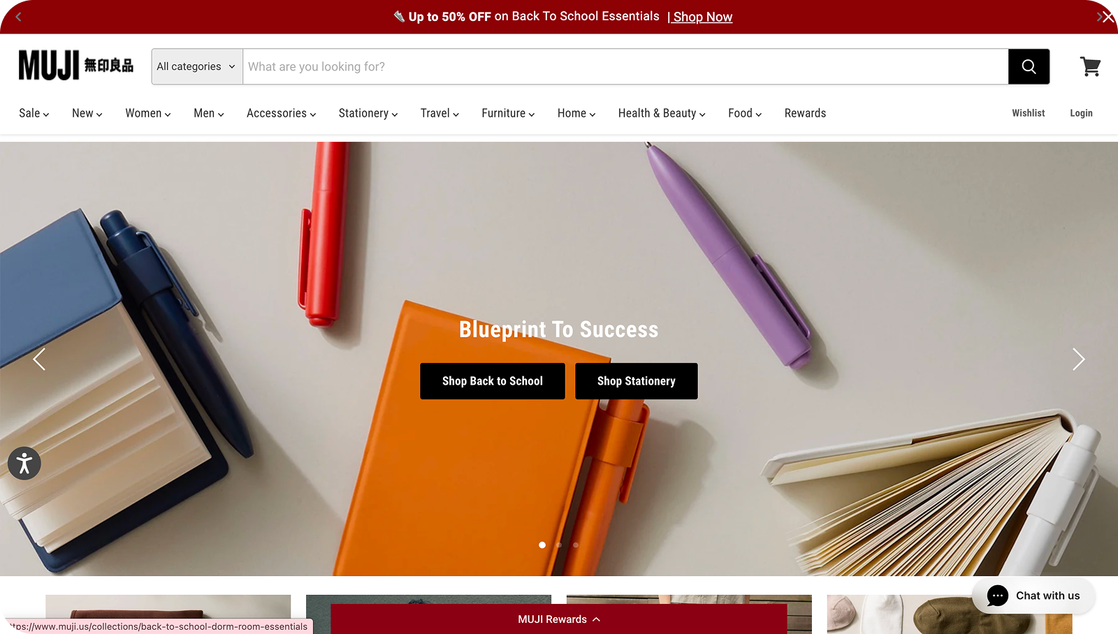
Intrusive promotion
Intrusive pop-ups make navigation difficult and undermines MUJI’s minimalist identity.
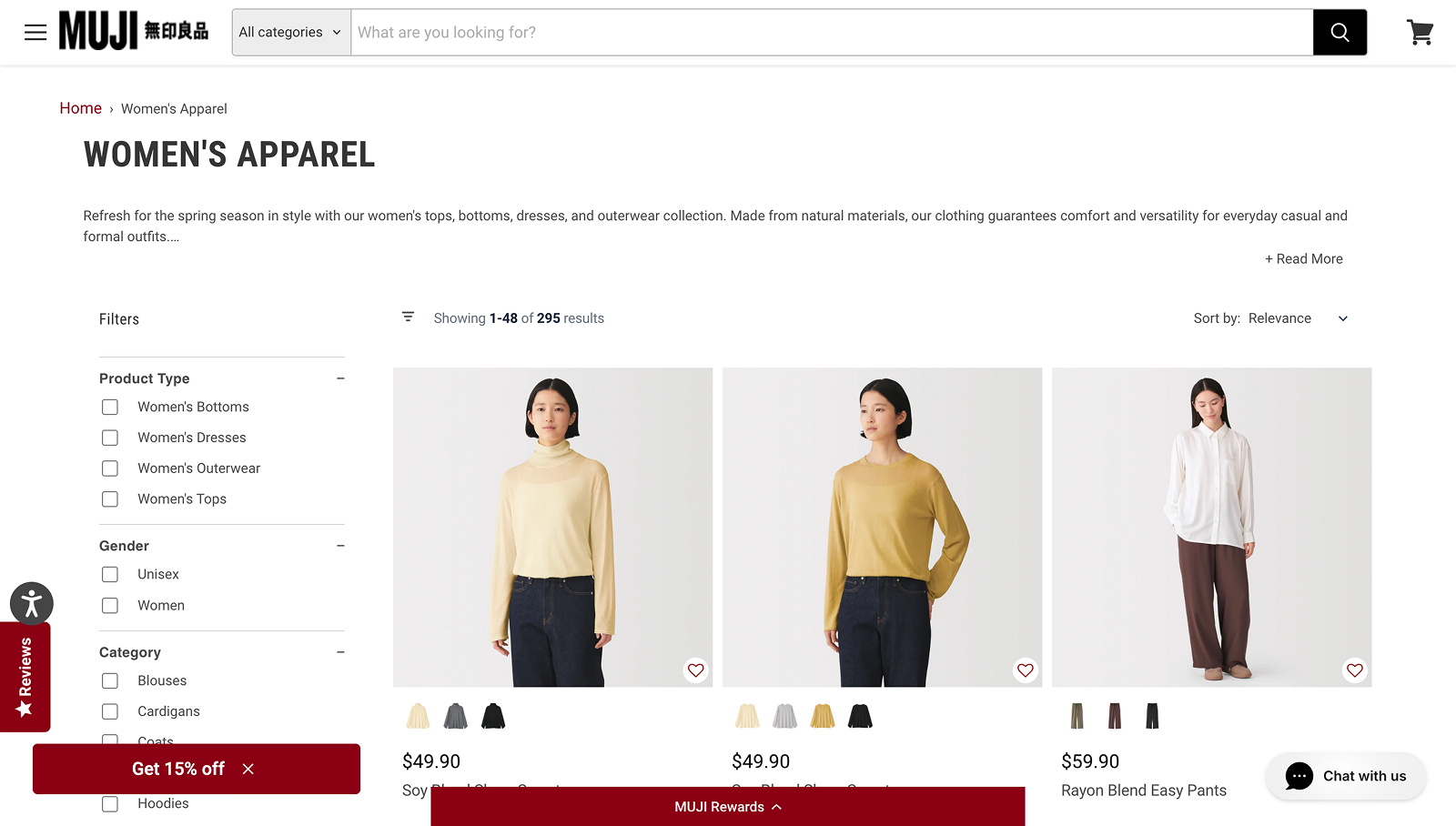
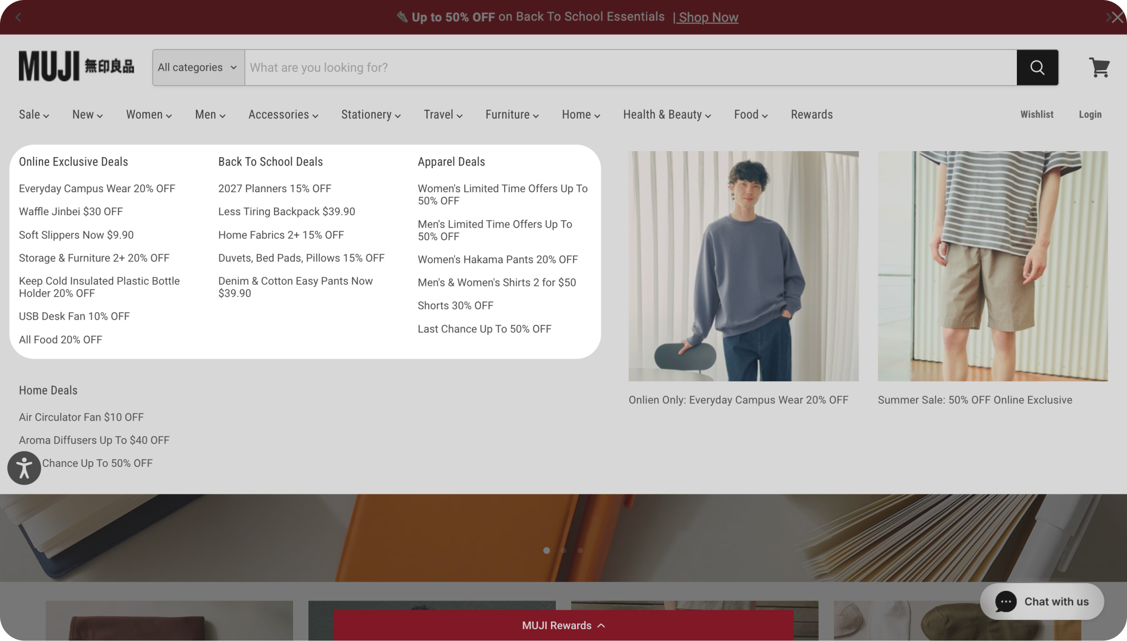
Poor web navigation
The nav bar was hard to read and poorly organized, making it hard to find specific products.
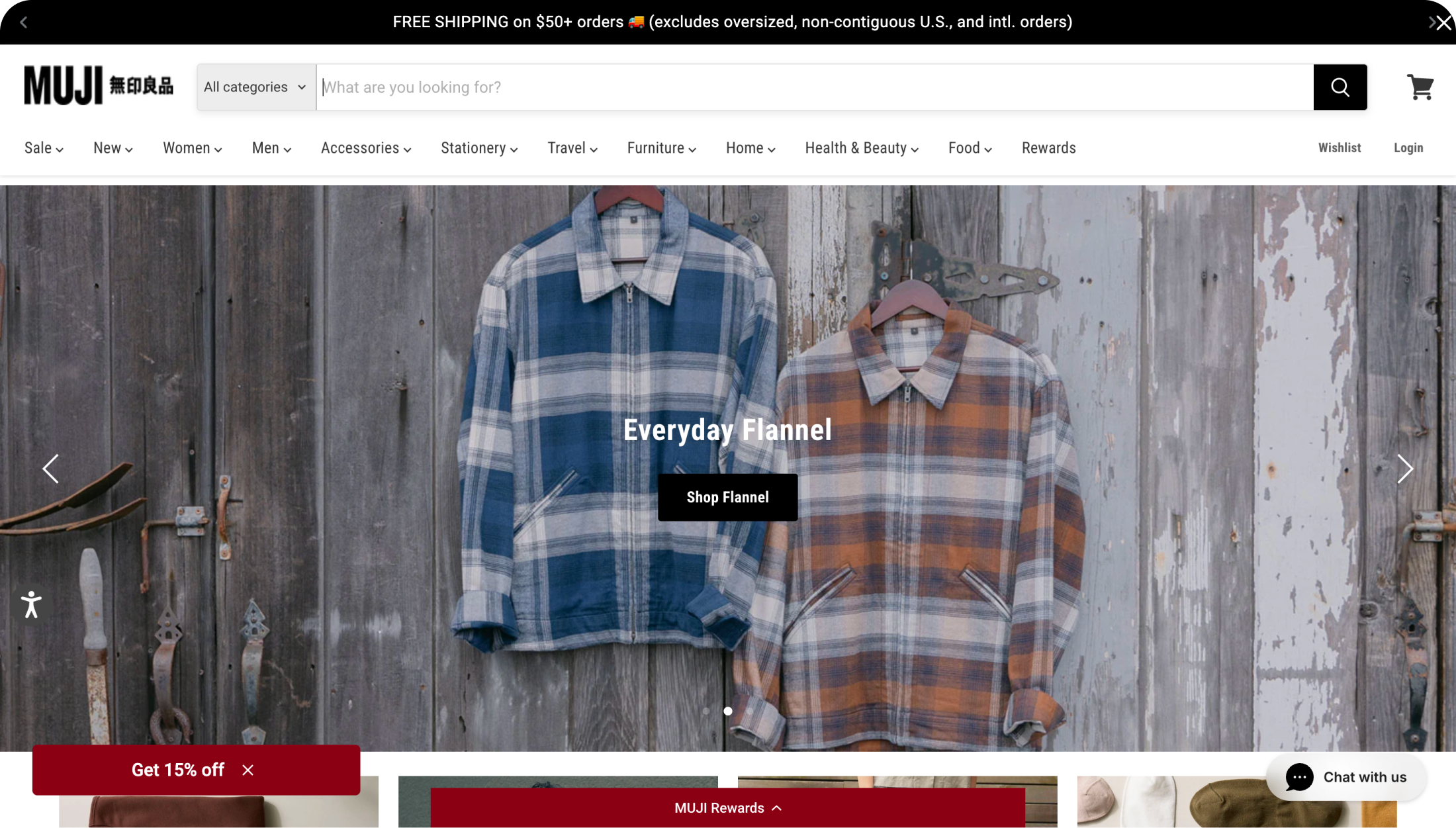
Lack of guidance for product discovery
There are no best-seller information or category displays, making it hard to discover products.
Missing the in-store atmosphere
MUJI stores has a calm and clean vibe, but the website feels more functional than immersive.
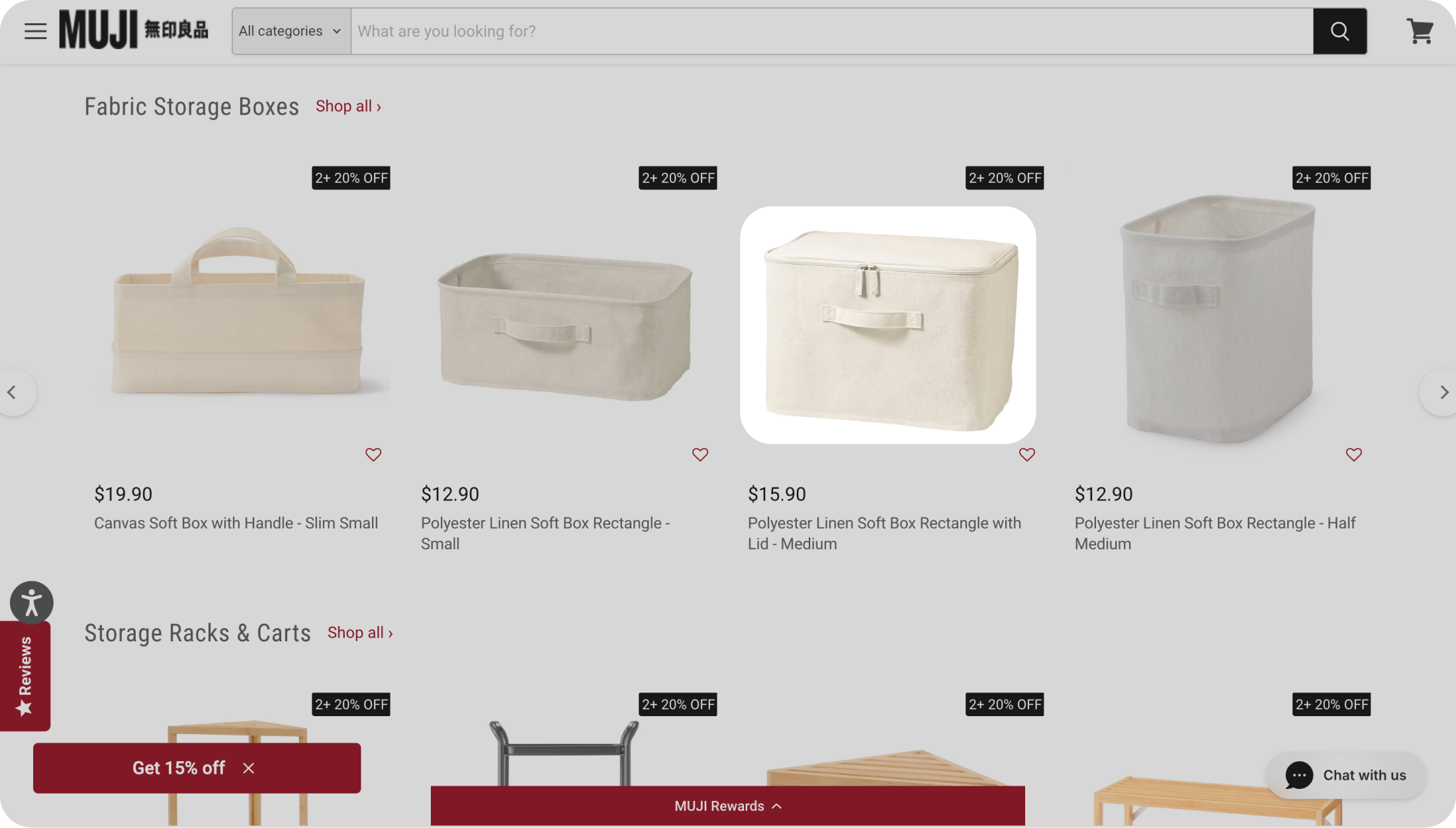
Choice of photos
Product photos feels more professional than intimate, missing the warmth of the in-store experience.
My redesign
I led the redesign of the checkout flow.
Our team divided the site into 5 sections and redesigned each to improve the pain points above. I owned the end-to-end redesign of the checkout flow while also providing feedback on the work of teammates in weekly meetings. To see how the other areas of redesign turned out, feel free to visit the final designs.
Concept ideation
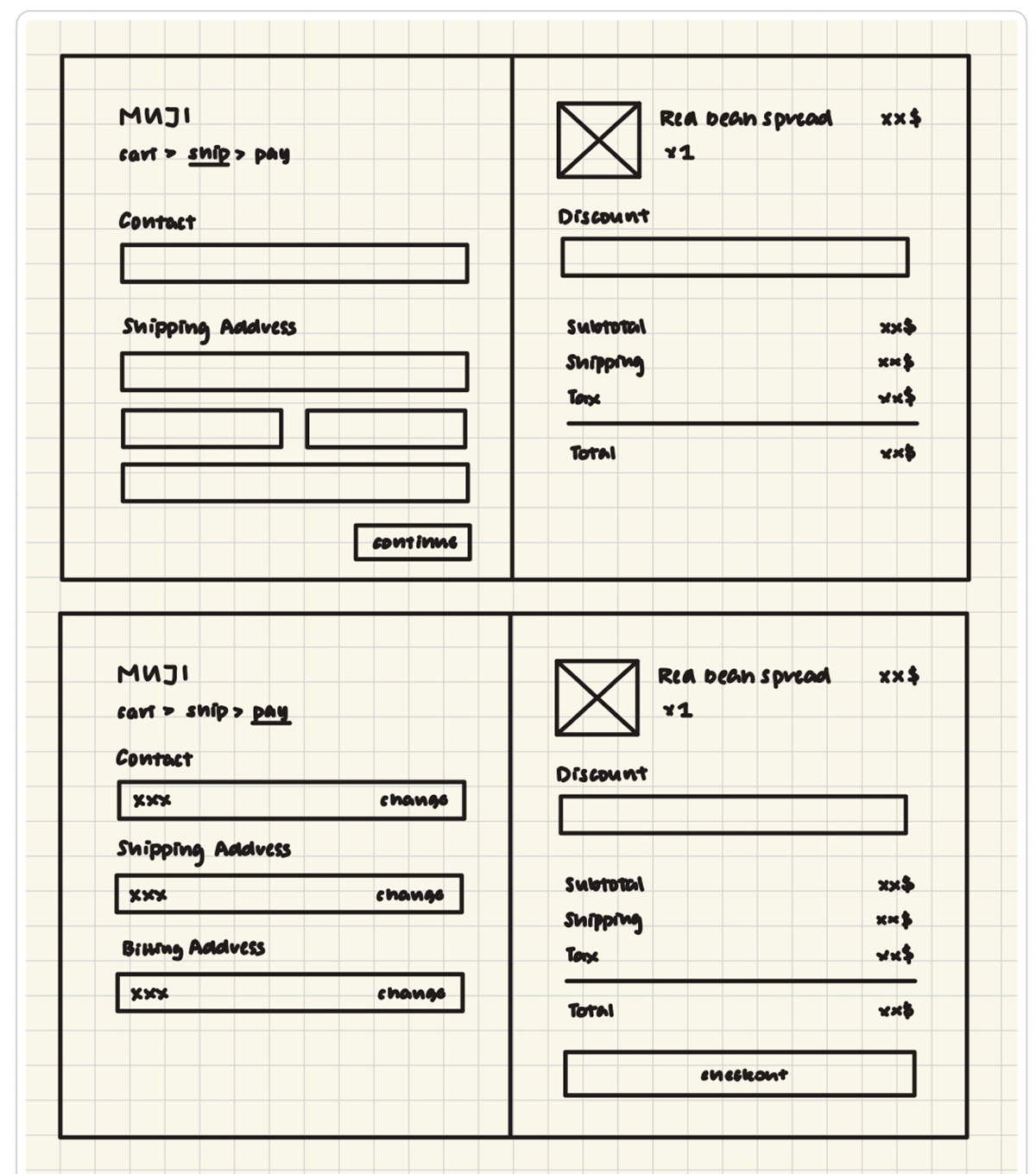
I drew low-fidelity mockups for the 3 stages of the checkout process.
Overall, the client and I aimed to preserve the promotional elements of the checkout flow and keep encouraging purchases, while also improving usability and guidance on product discovery. The direction of my following iterations were also informed by the more detailed feedback below.
Stage 1. Adding an item
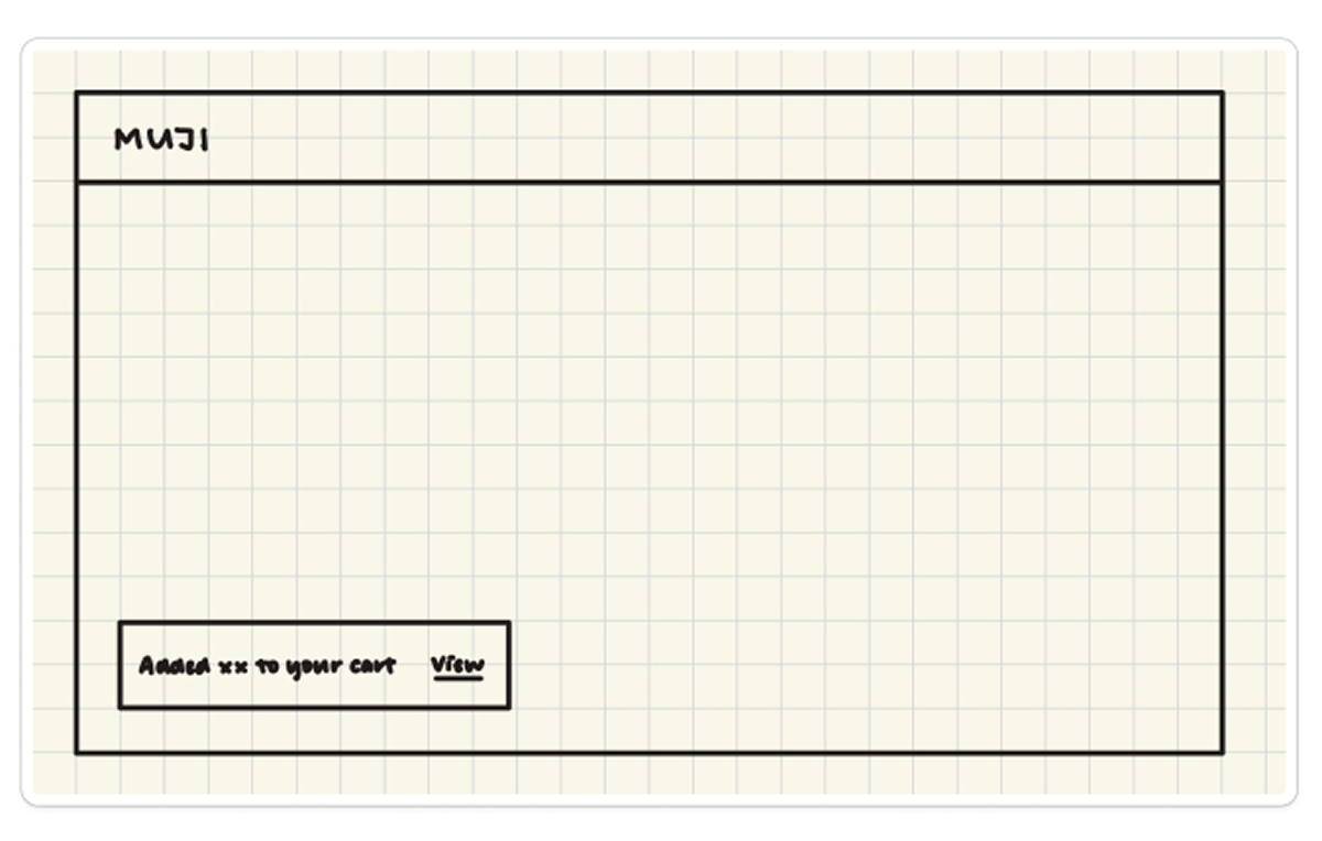
Version 1
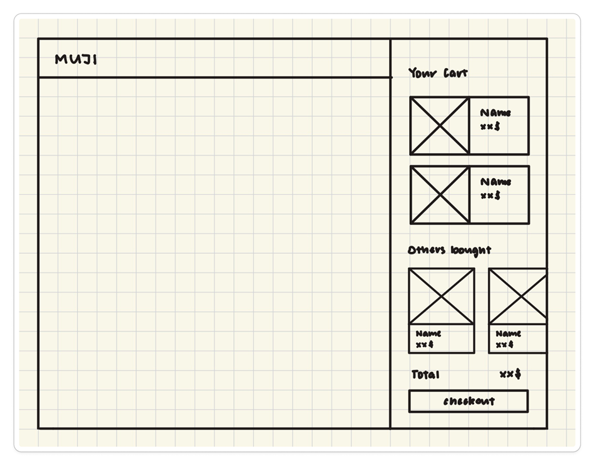
Version 2
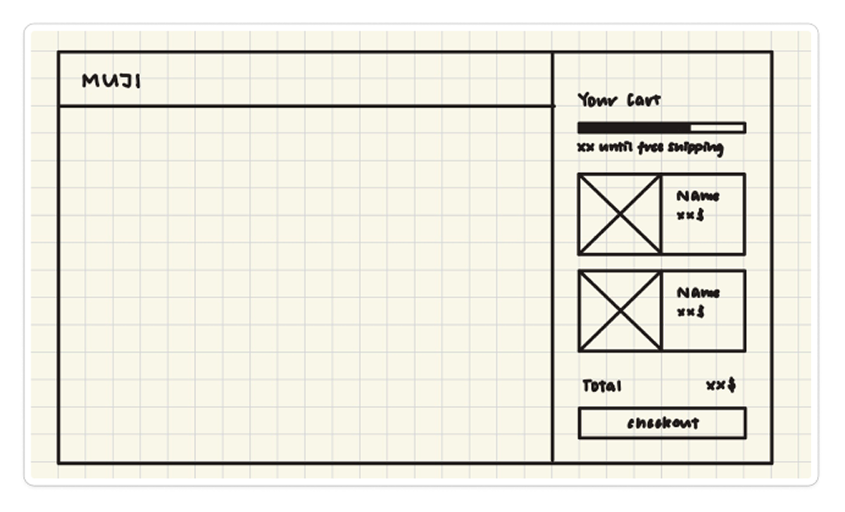
Version 3
Stage 2. Reviewing your cart
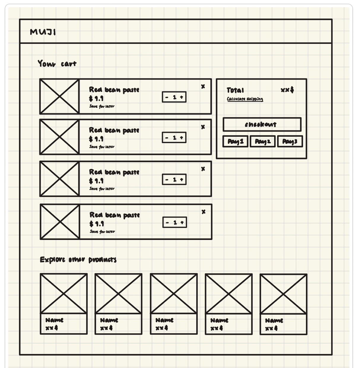
Version 1
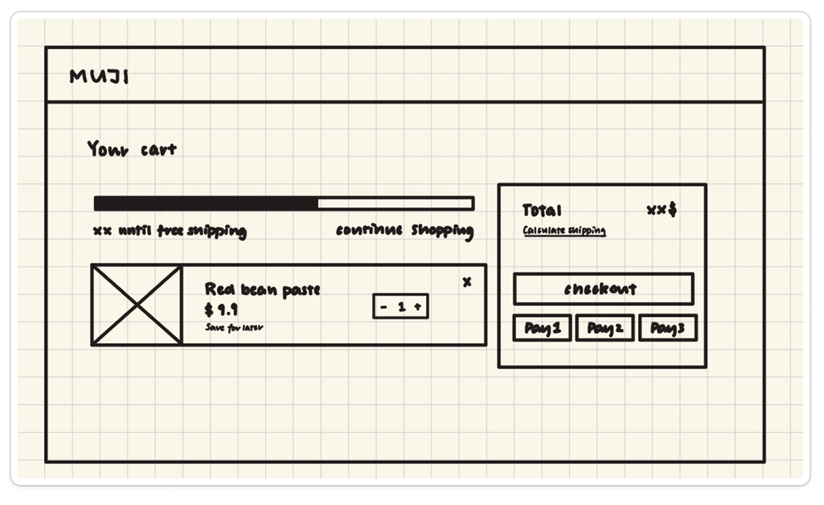
Version 2
Stage 3. Filling payment information
Design decisions
Adding an item to the shopping cart
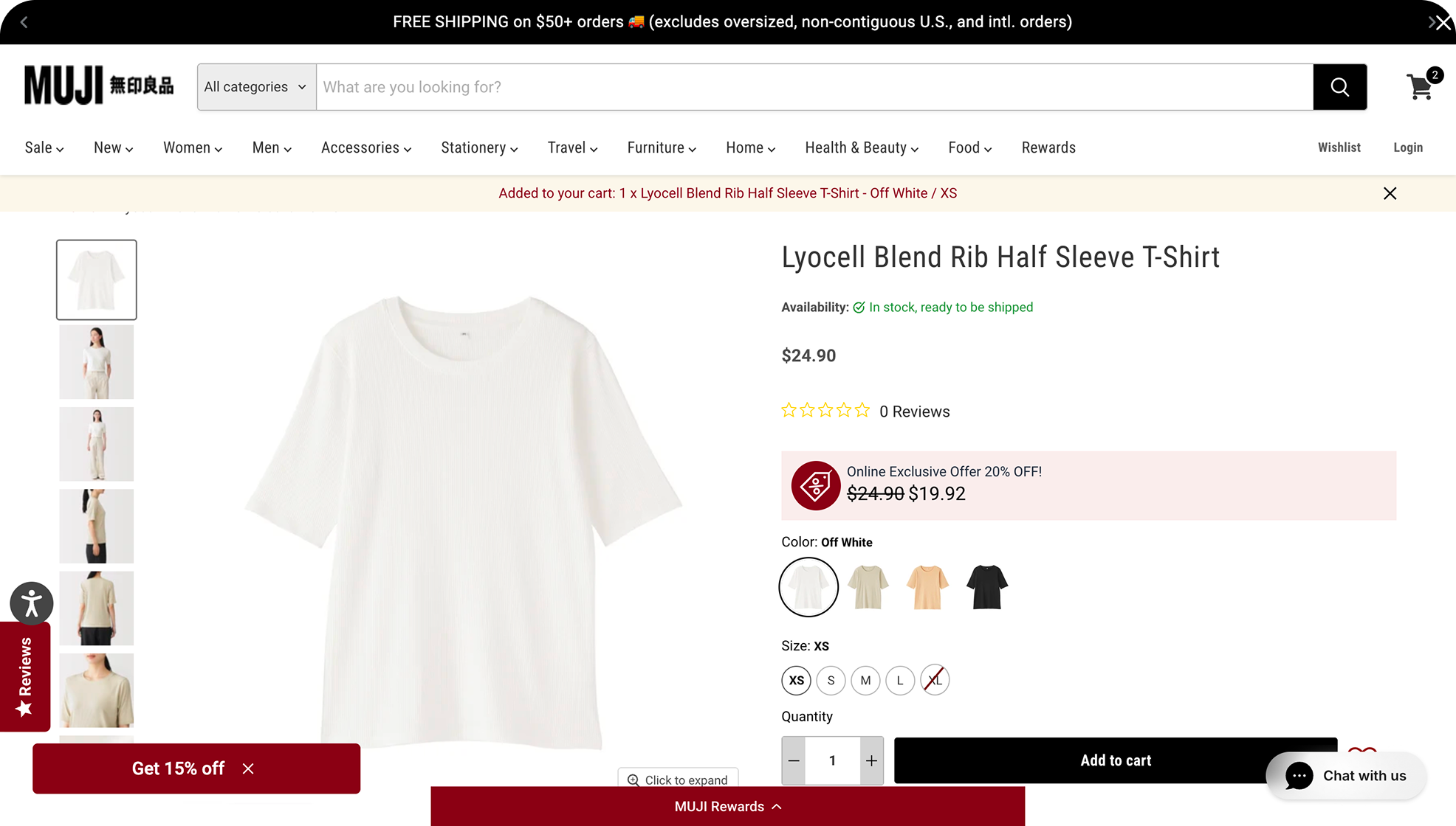
Current Design
Static notification at the top of the screen without a button to open the cart directly.
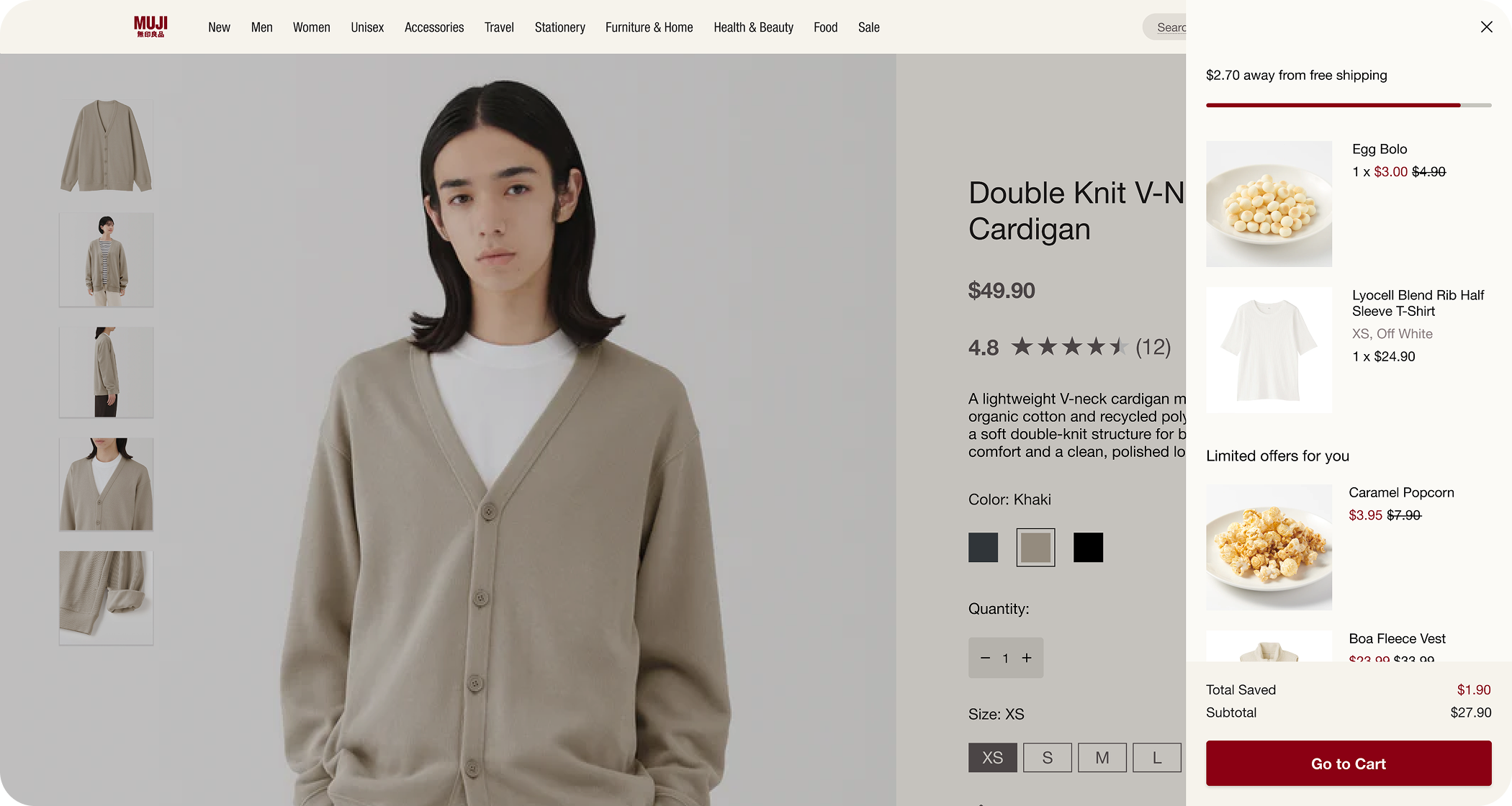
Redesign
Cart drawer slides in automatically after an item is added to cart, improving usability and providing space for upsell.
02 Lack of guidance for product discovery
Discounted items have their sale price in red and original price beside, along with the “total saved” number, nudges users towards items on sale without being intrusive.
01 Intrusive promotion
Design decisions
Reviewing the shopping cart
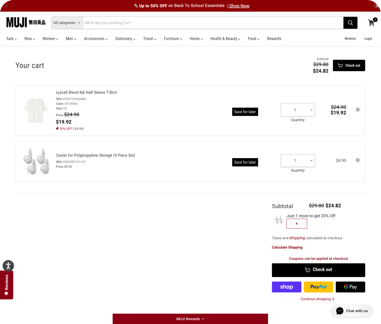
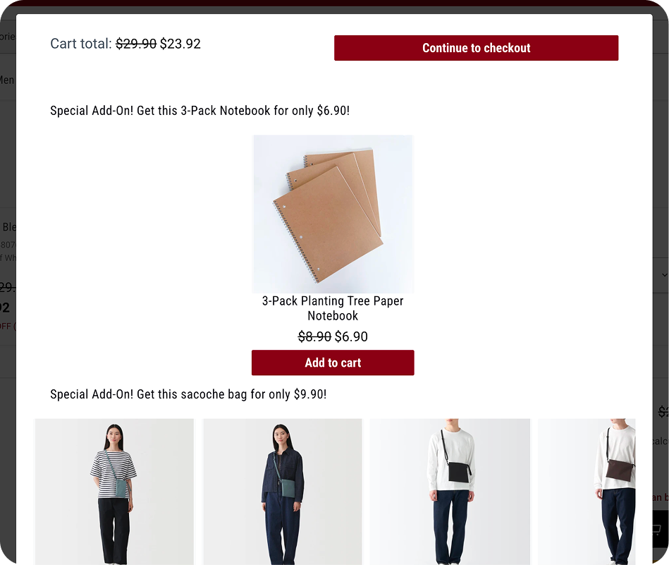
Current Design
Intrusive pop-up after clicking “Check out”
01 Intrusive promotion
Two occurrences of the “Check out” button
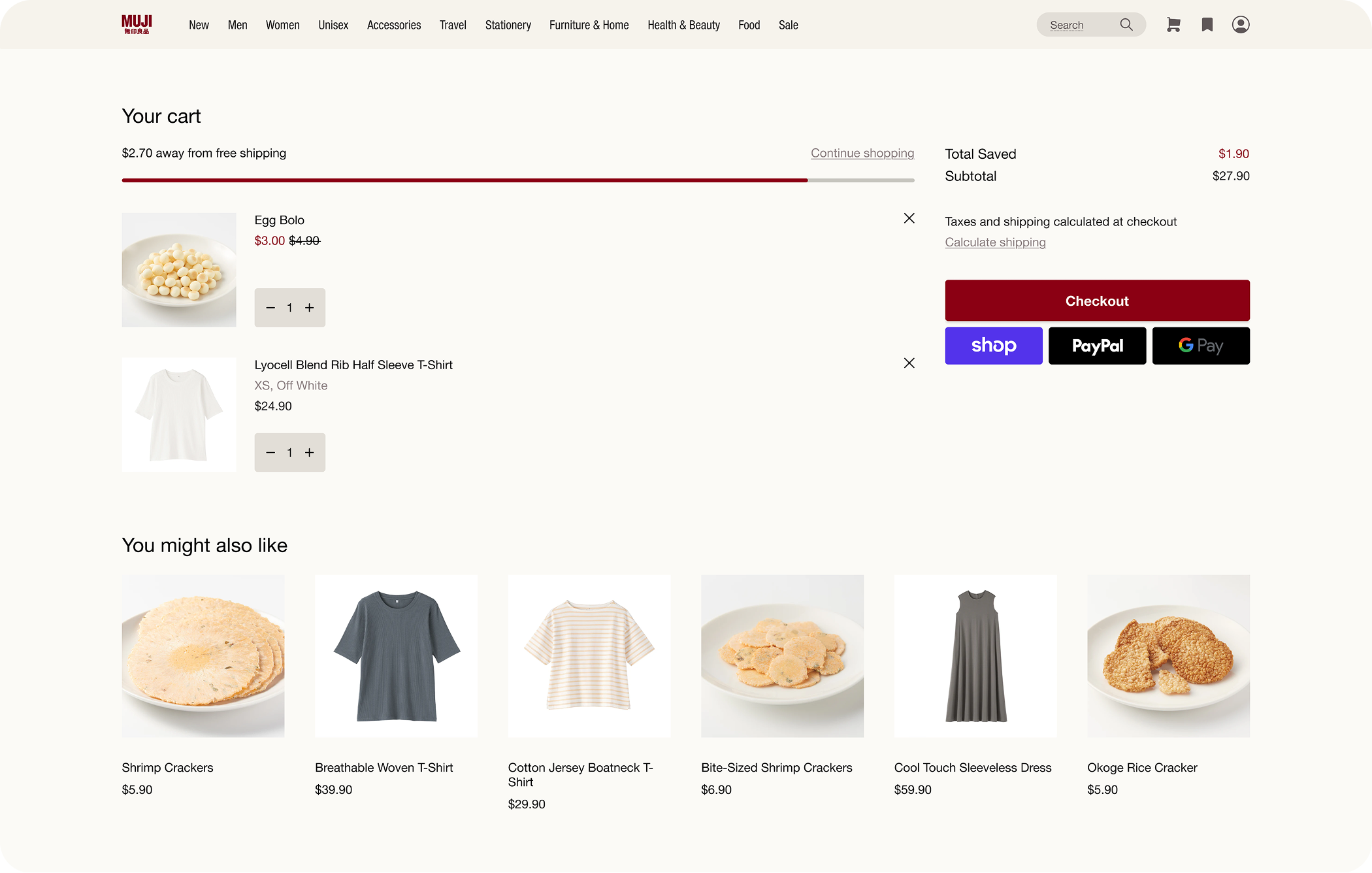
Redesign
Pop-up replaced with a free shipping progress bar and product recommendations — both less intrusive ways of upselling.
01 Intrusive promotion
Product recommendations are based on browsing history. This allows for personalized guidance in product discovery and can be applied to both signed-in and guest users.
02 Lack of guidance for product discovery
Design decisions
Filling in shipping and payment information
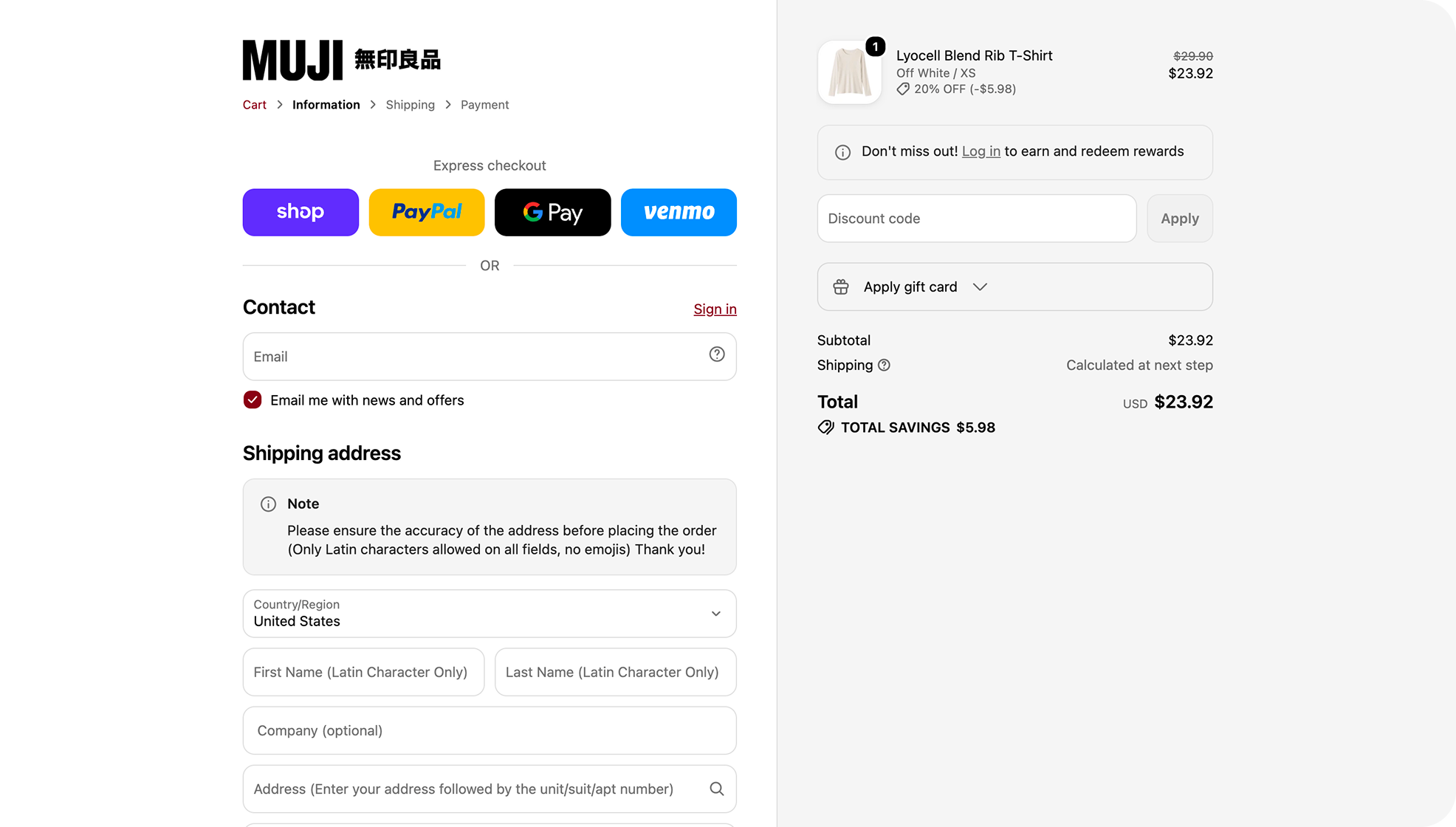
Current Design
The checkout page currently uses Shopify’s default layout, which breaks the consistency with the MUJI brand.
Missing the in-store atmosphere
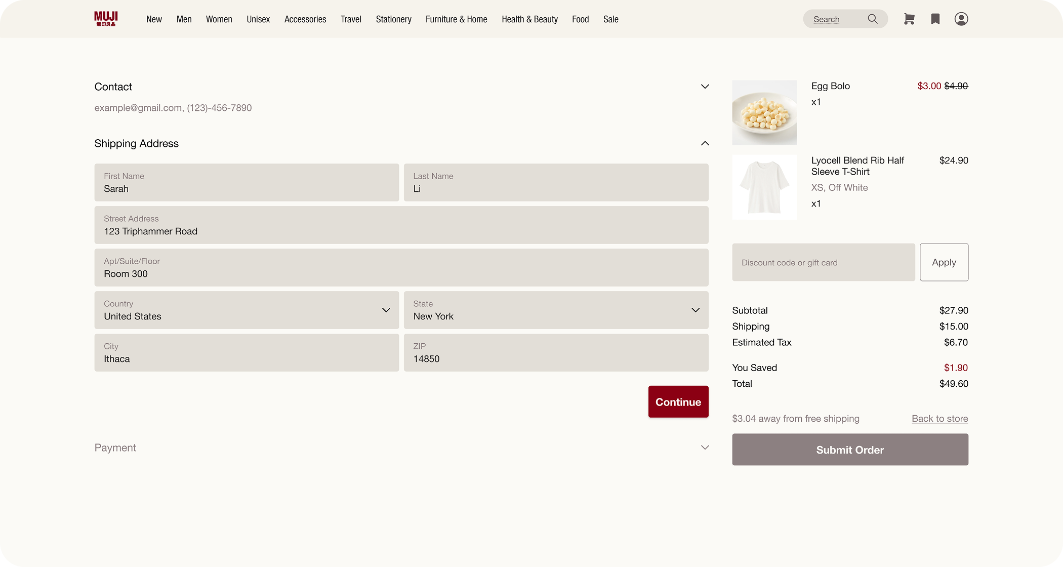
Redesign
I redesigned the interface in MUJI’s design system to keep brand identity and visual style consistent.
Missing the in-store atmosphere
Final designs
Home Page
We shifted the homepage from a promotional upsell page to a lifestyle showcase, guiding product discovery more naturally through categories instead of pop-ups.
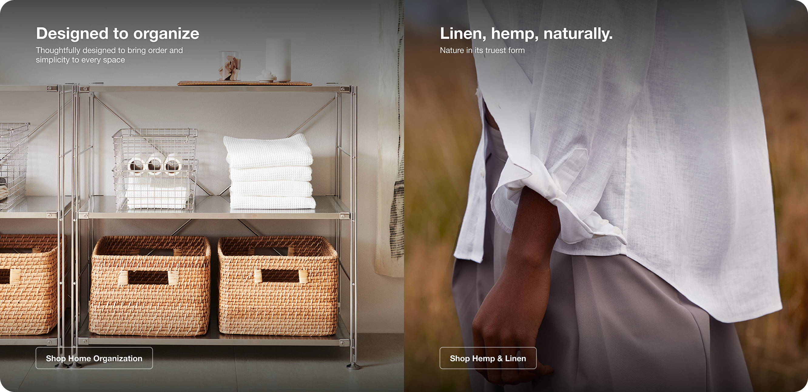
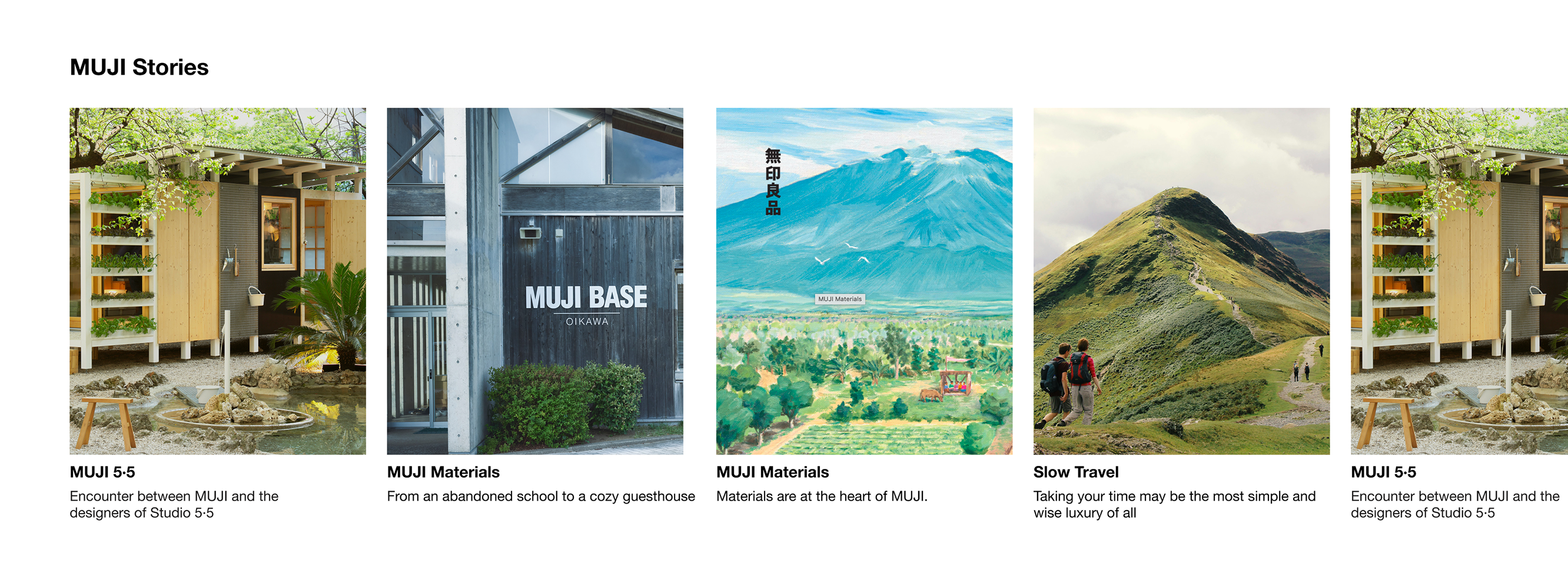
We made the visual style cleaner, calmer, and less promotional, and chose more intimate photography over polished studio shots, both to bring back the feel of MUJI’s physical stores.
We added brand storytelling around MUJI’s craftsmanship, since our research showed Gen Z needs to connect with a brand’s story before engaging with its products.
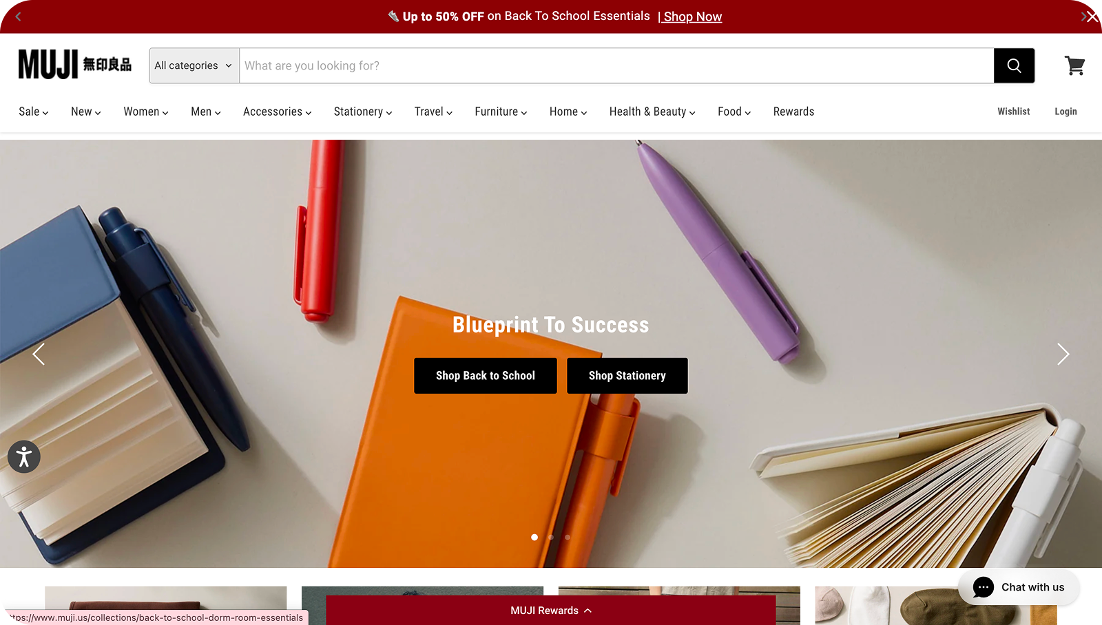
Current Design
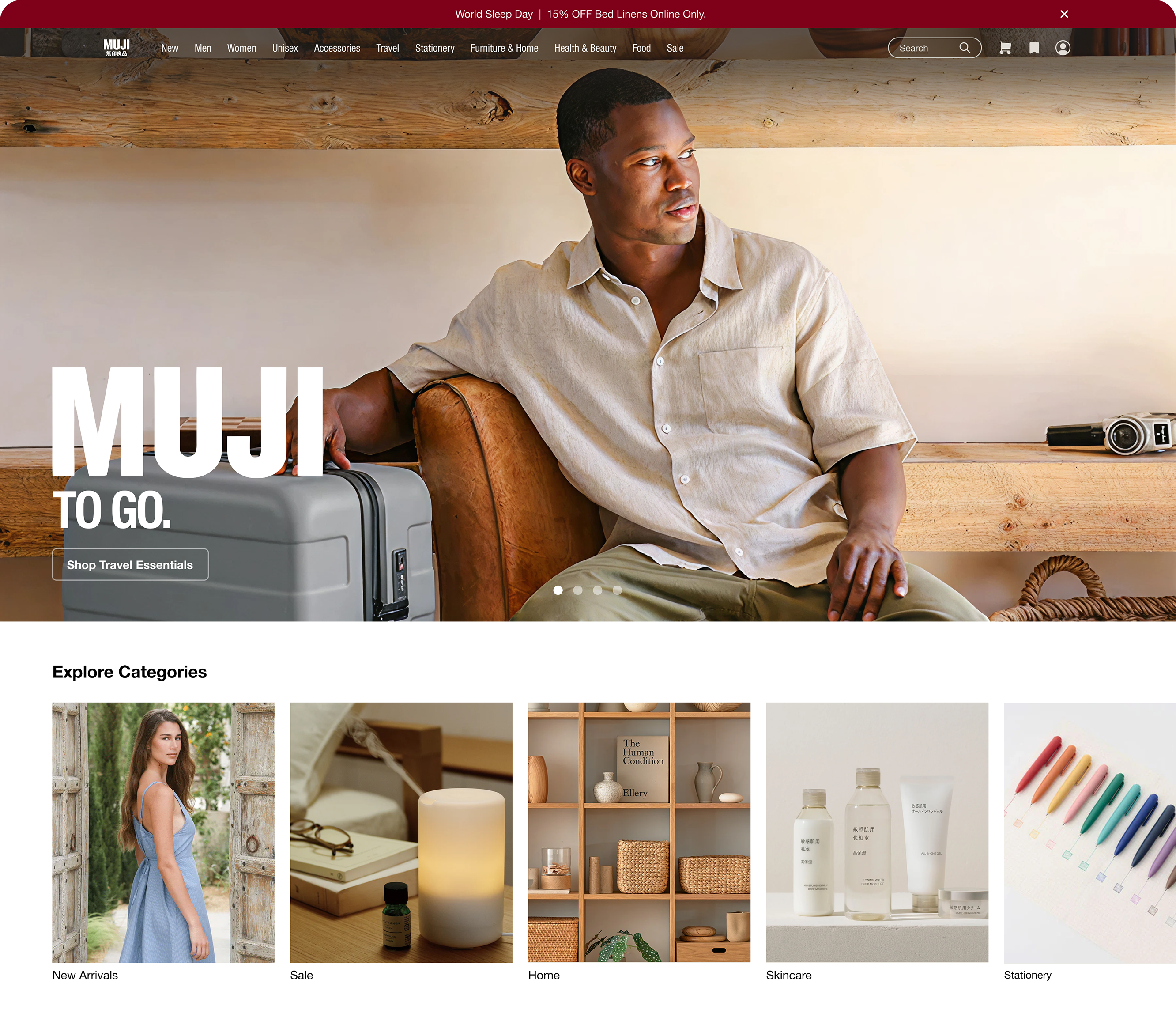
Redesign - Hero section and product categories
Redesign - Product photos
Redesign - Brand stories

Redesign - Material showcase
Final designs
Navigation Bar
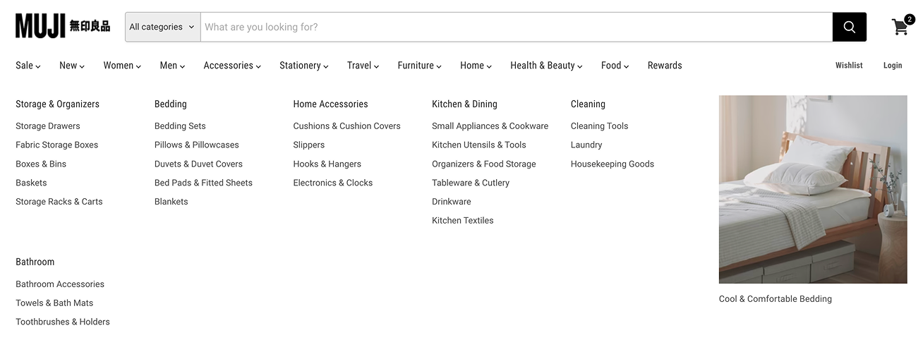
Competitor research showed that a cleaner, simpler catalog structure works better — so we cut down the number of subcategories. We also added thumbnail images to each category, since a visual encourages exploration more than plain text.
Current Design

Redesign
Final designs
Category Page
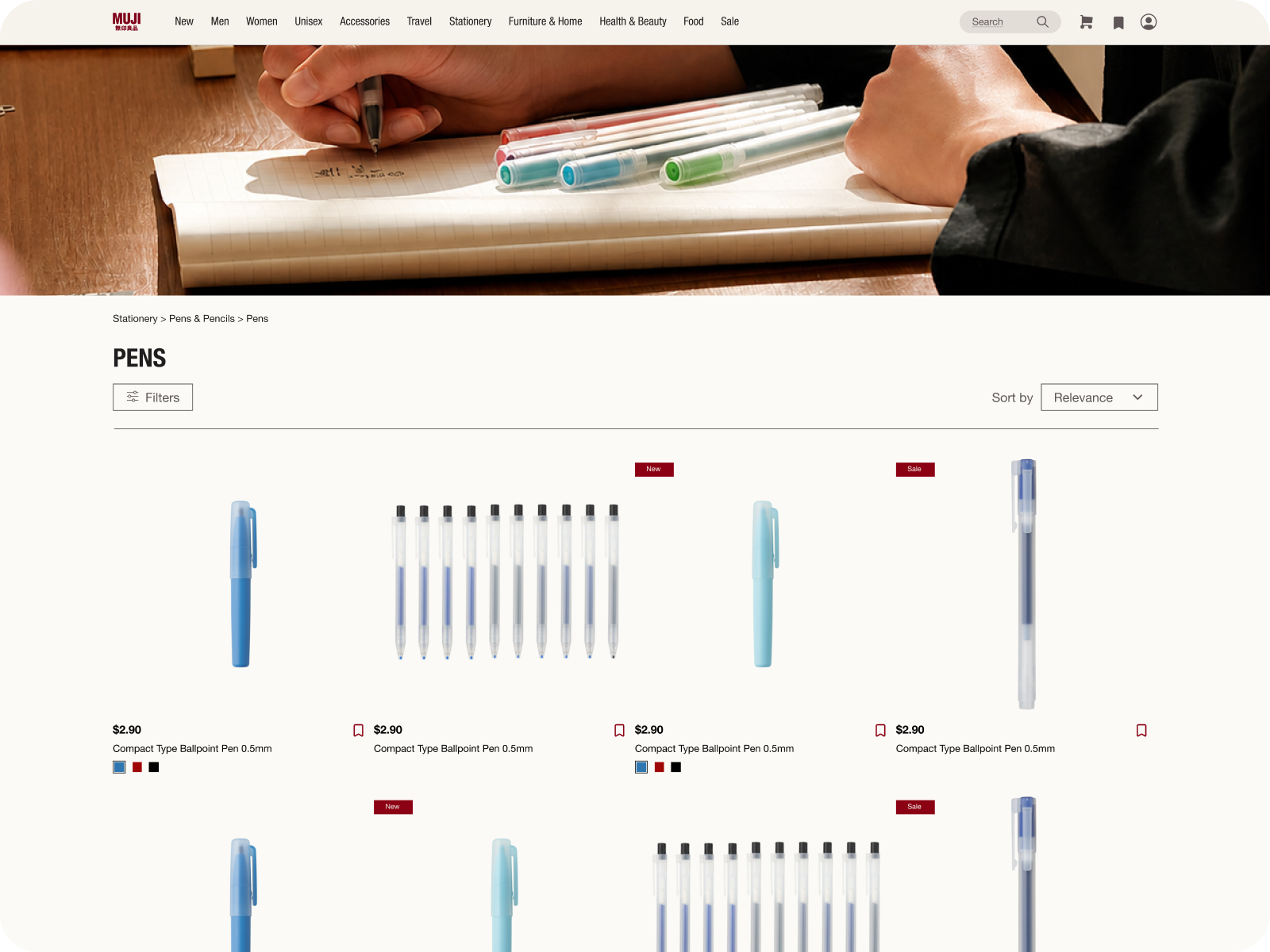
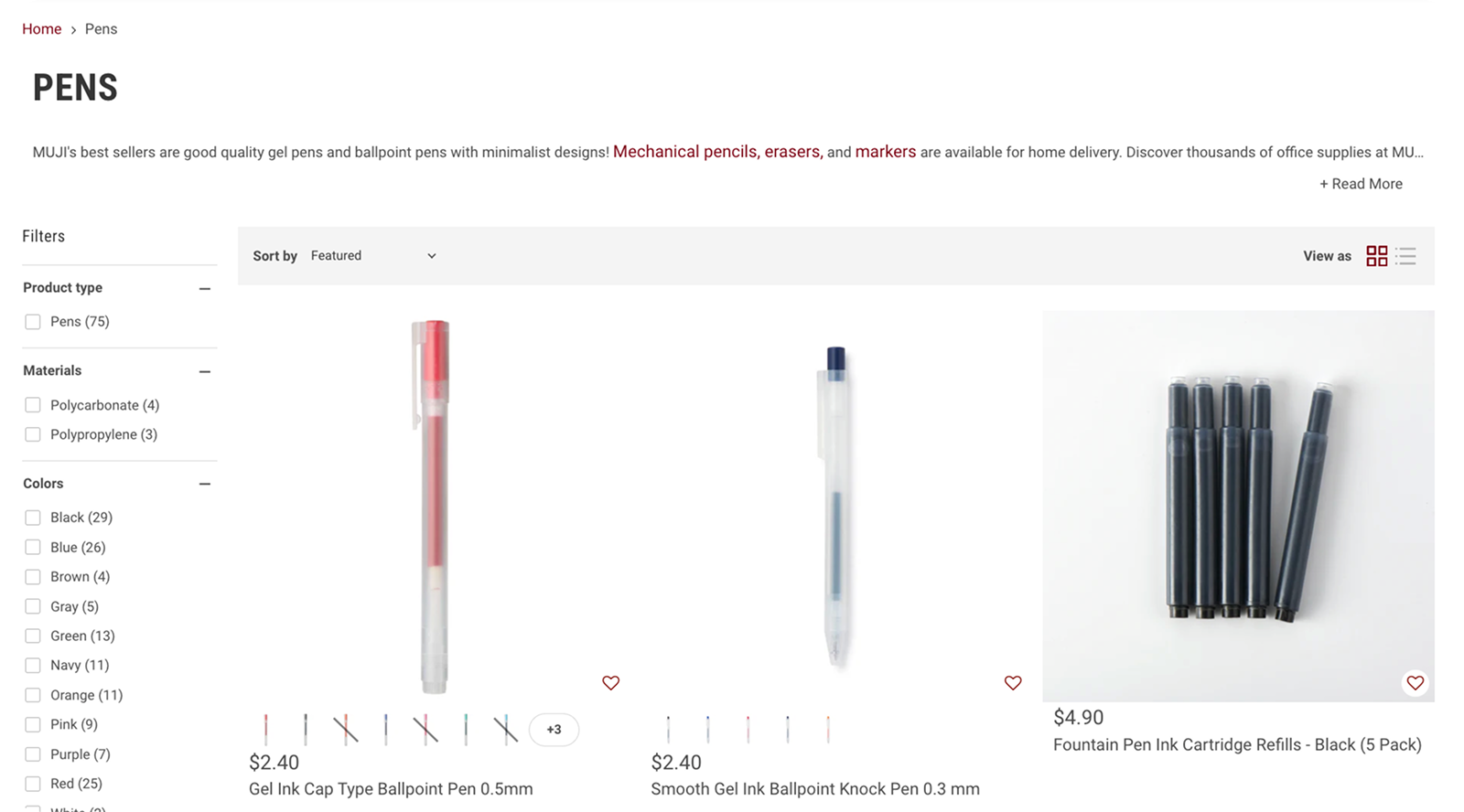
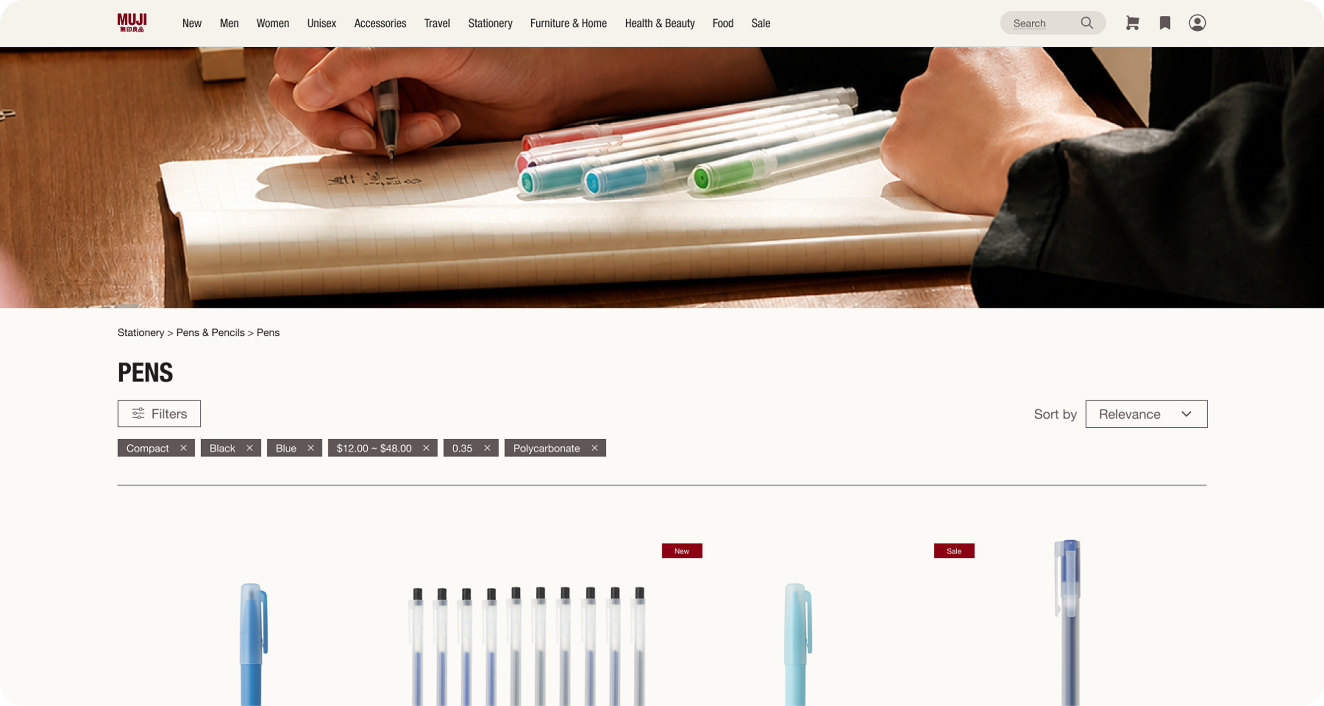
We made filters collapsible to reduce clutter, and added a header image to each category page for a more immersive browsing experience.
Current Design
Redesign - Filters collapsed
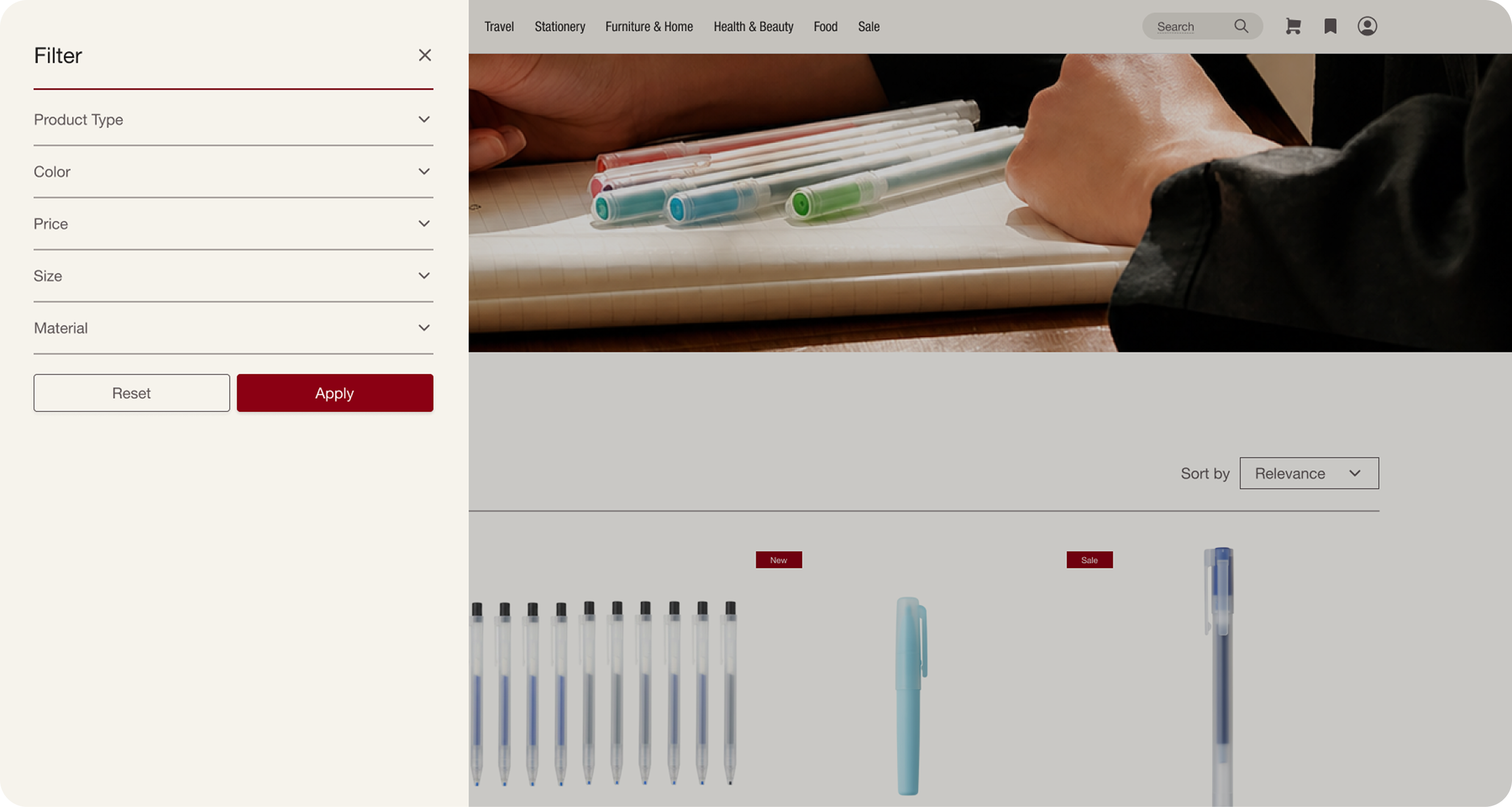
Redesign - Filters expanded
Final designs
Item Page
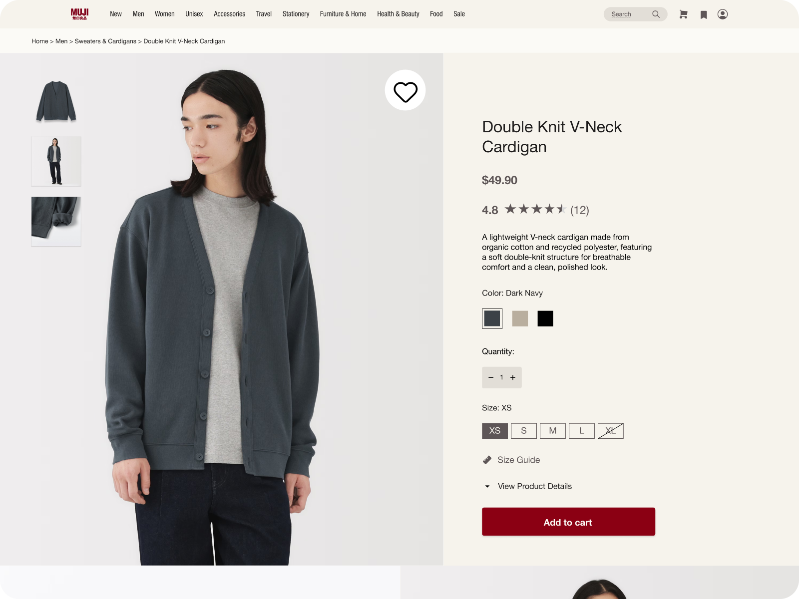
We simplified the item page by moving supplemental information to a section at the bottom, reducing clutter up top, and cut down on icons and text that were distracting.
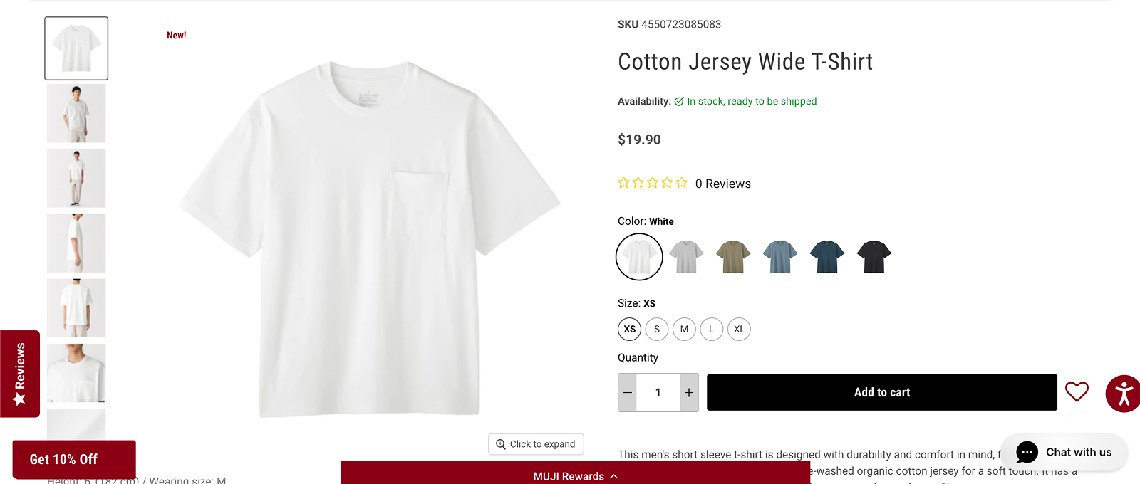
Current Design - Product Information
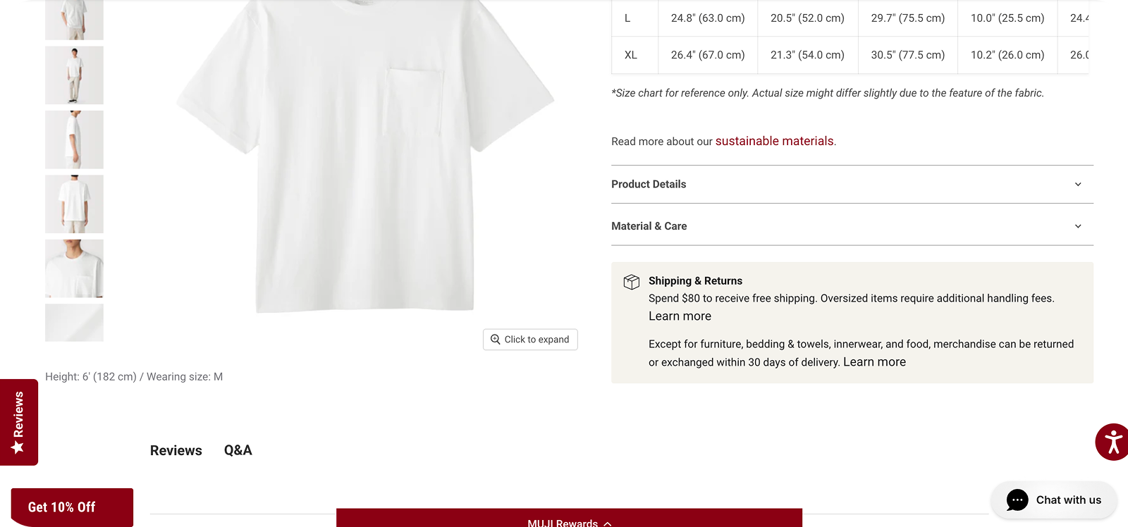
Current Design - Product Details
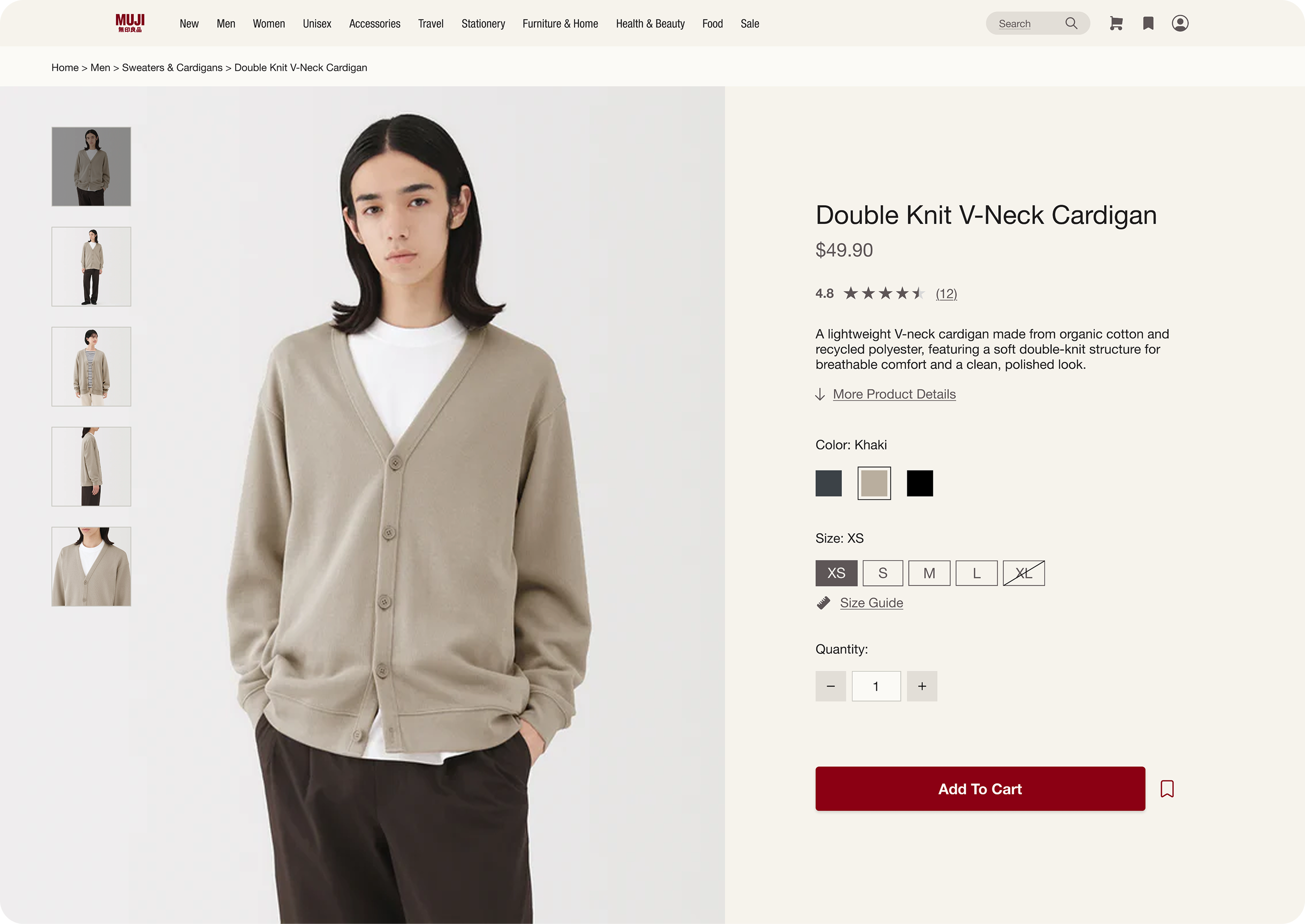
Redesign - Key Product Information
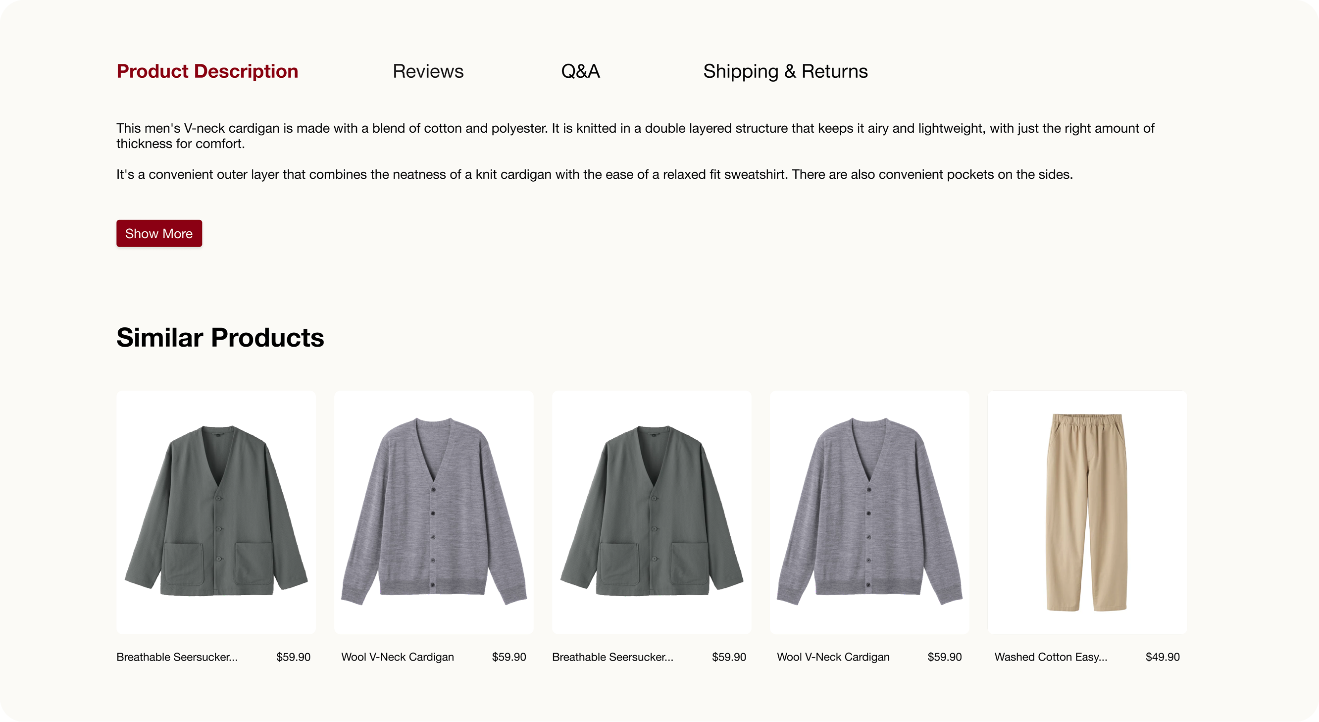
Redesign - Supplementary Content
Final designs
Checkout Flow
We replaced intrusive upselling with more natural, guided discovery, and revamped the checkout UI to stay visually consistent with MUJI’s style.
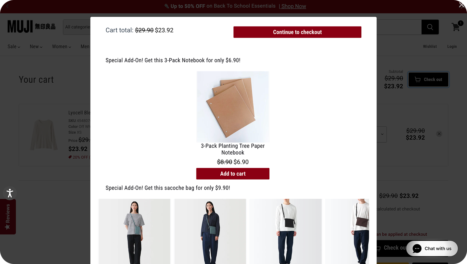
Current Design - Pop-up at check out
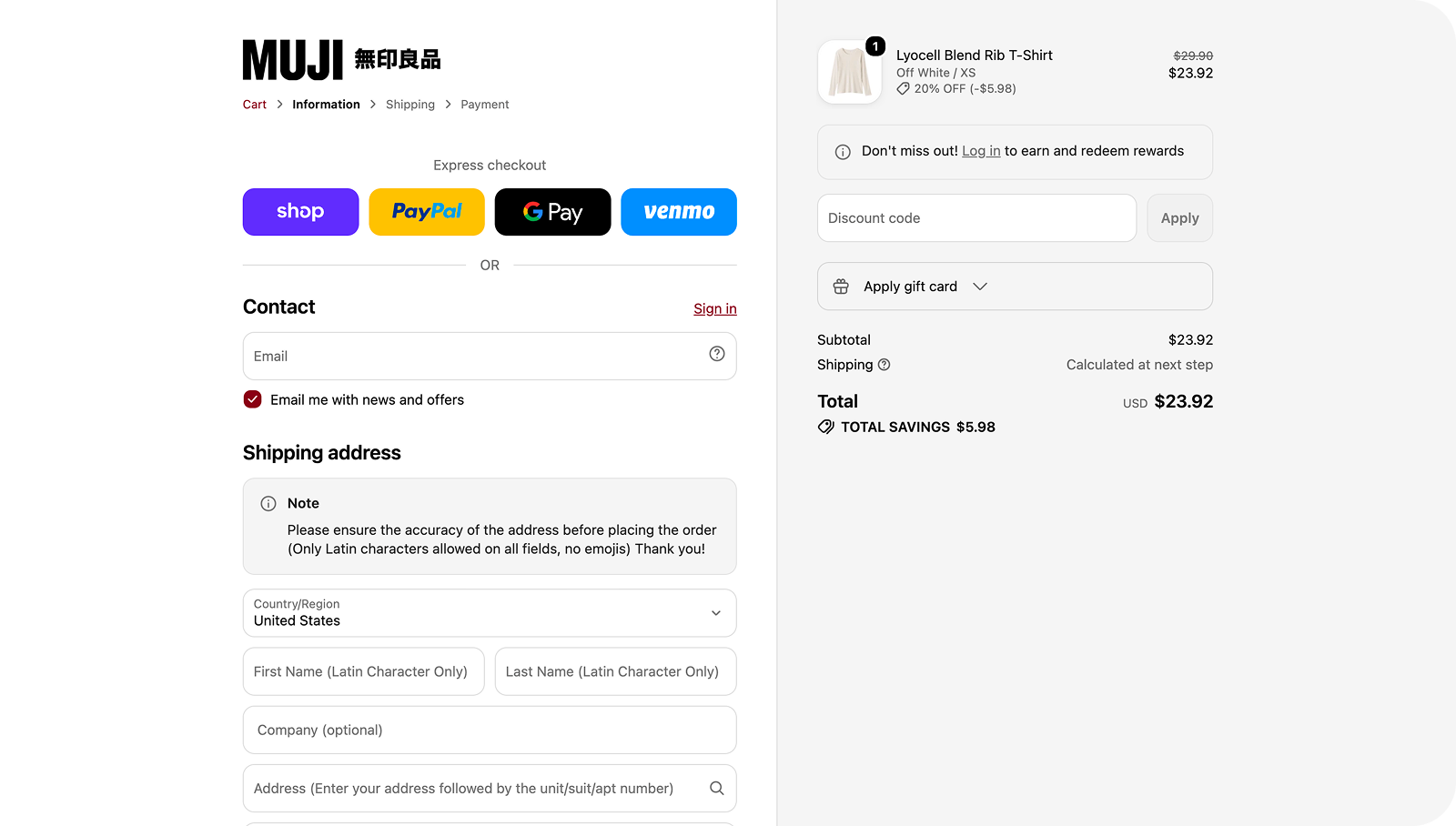
Current Design - Address and payment forms
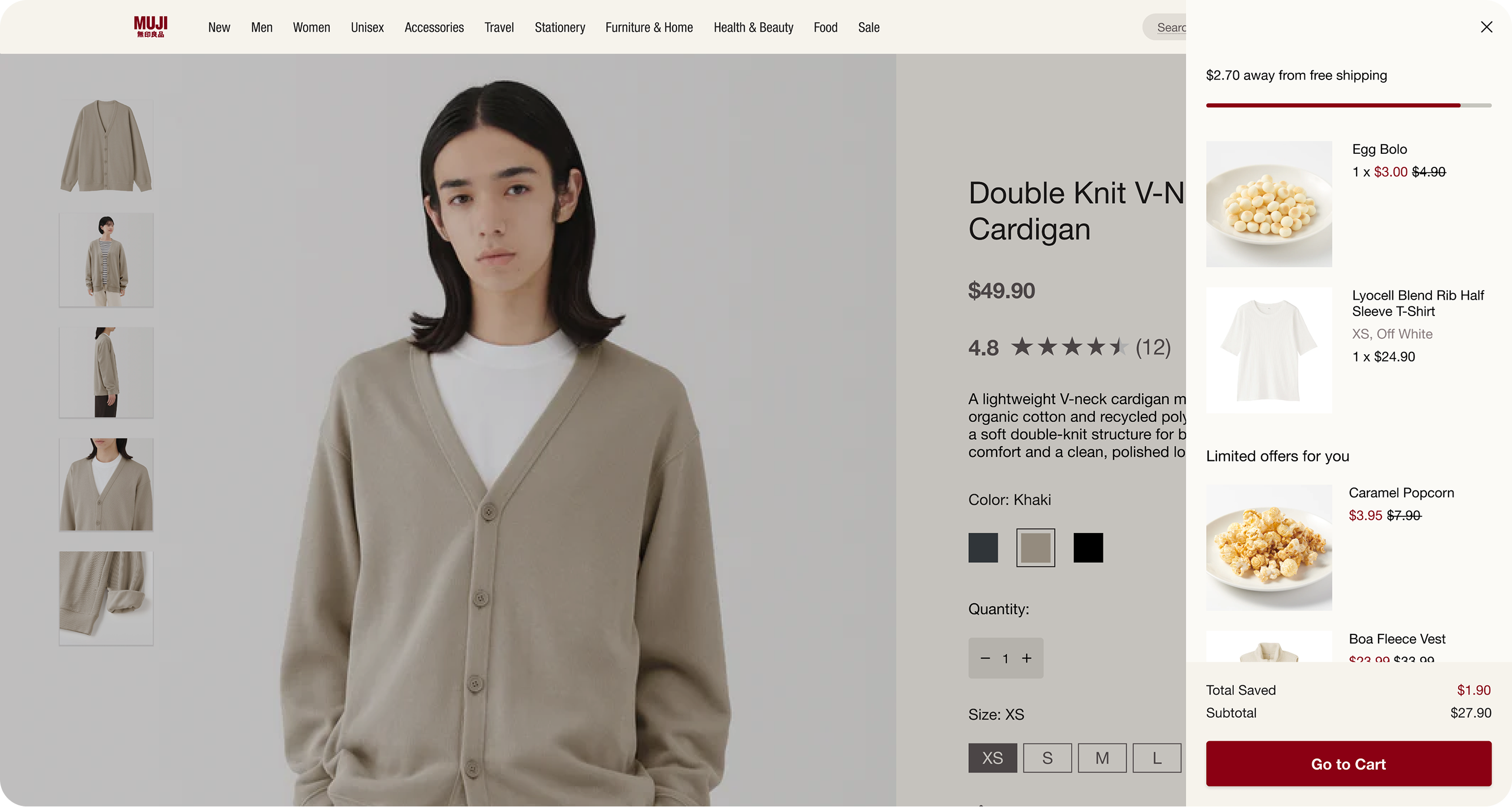
Redesign - Cart drawer
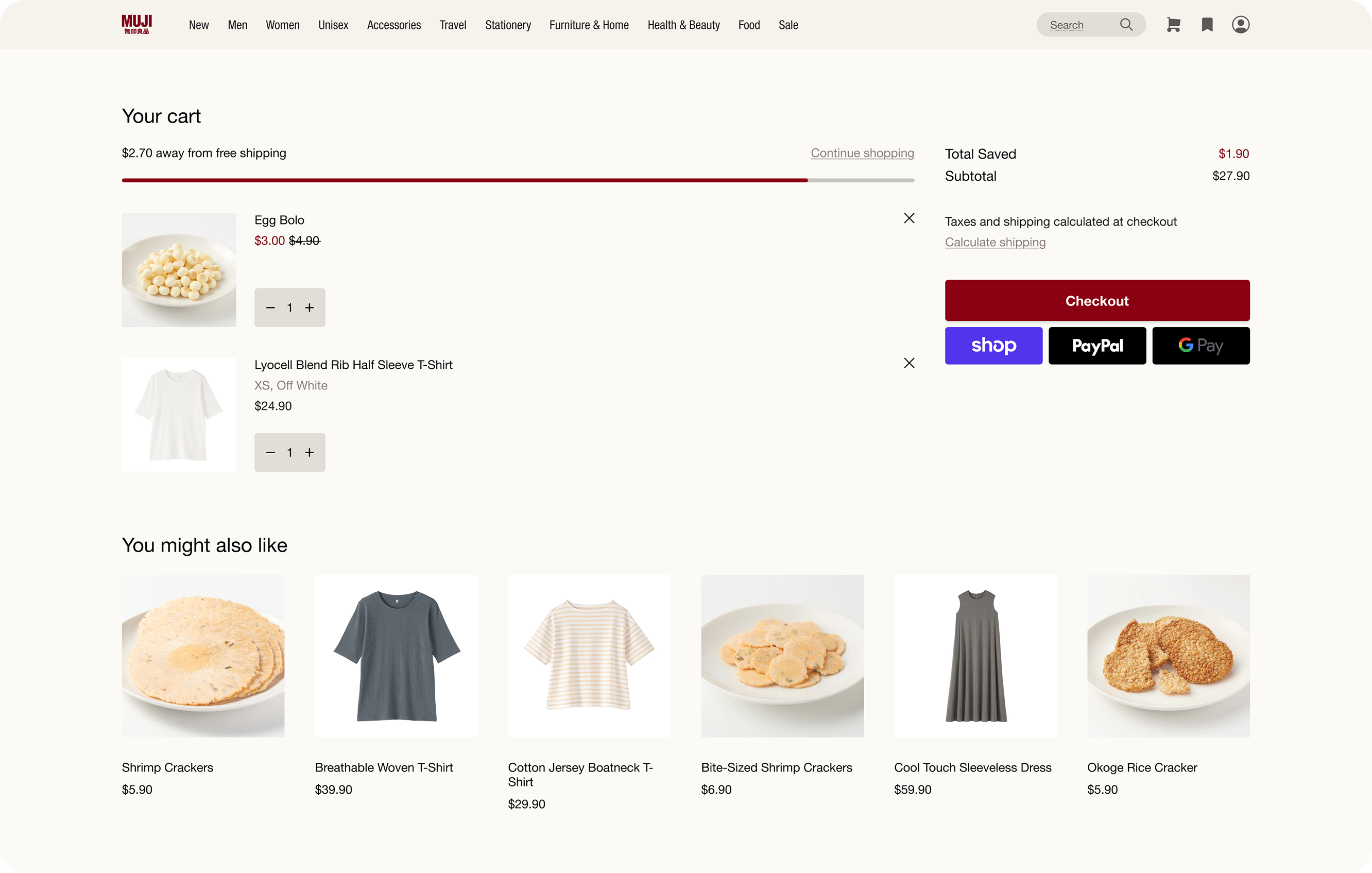
Redesign - Shopping cart
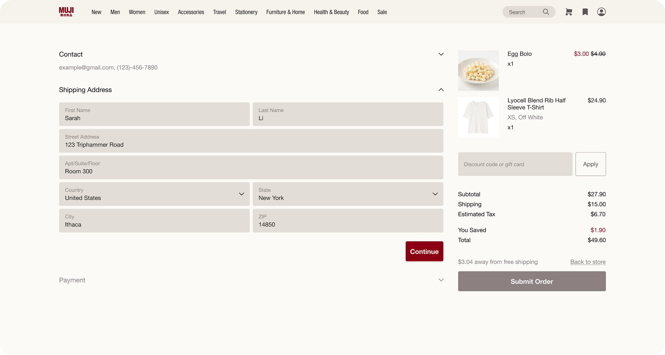
Redesign - Address and payment forms