Wapoo AI
AI-powered short-form video social app for Gen-Alpha
The Company
Who is Wapoo?
Wapoo is a mobile social app targeting Gen Alpha users in the US, where people can use AI to warp and remix short-form videos, including “twisting” someone else’s video to give it a new ending, before sharing it within the app.
Wapoo’s logo
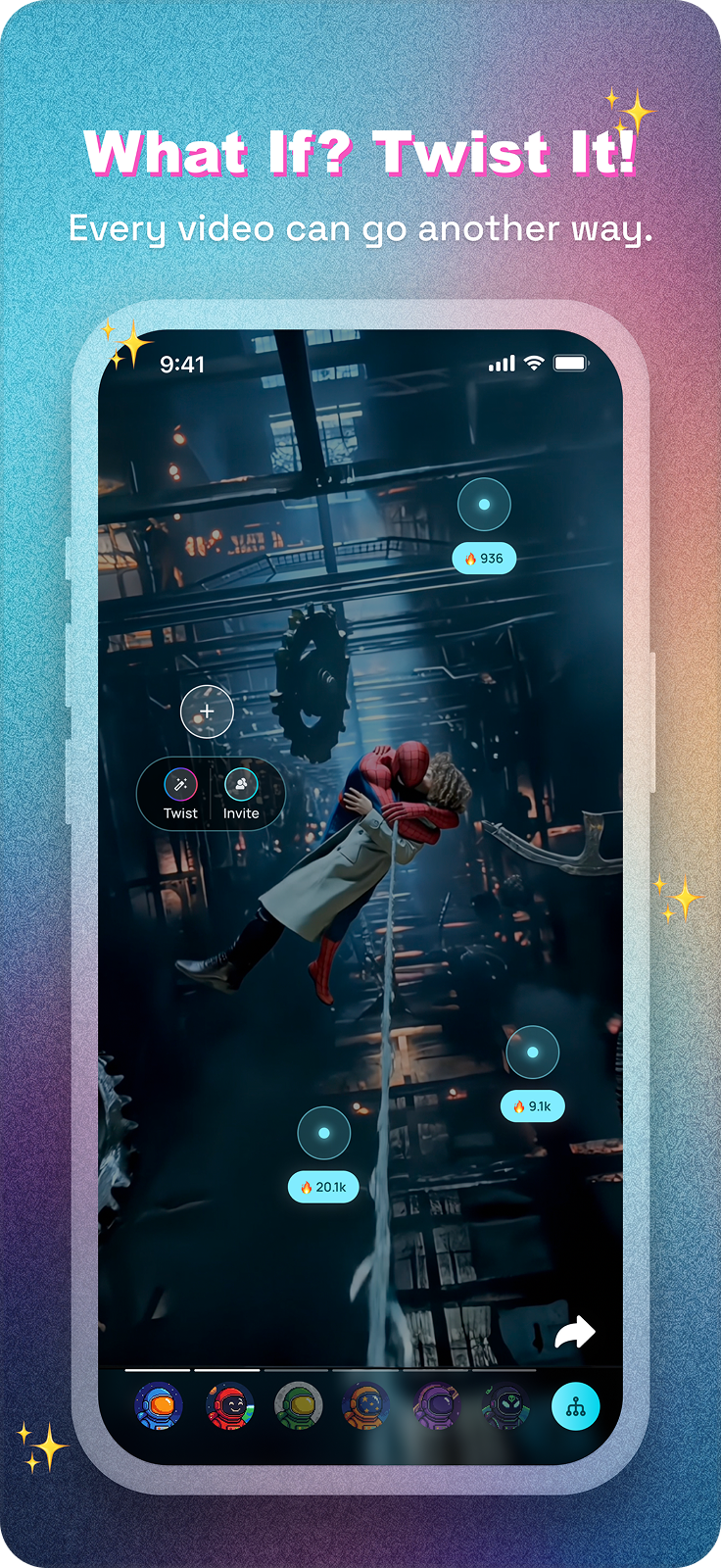
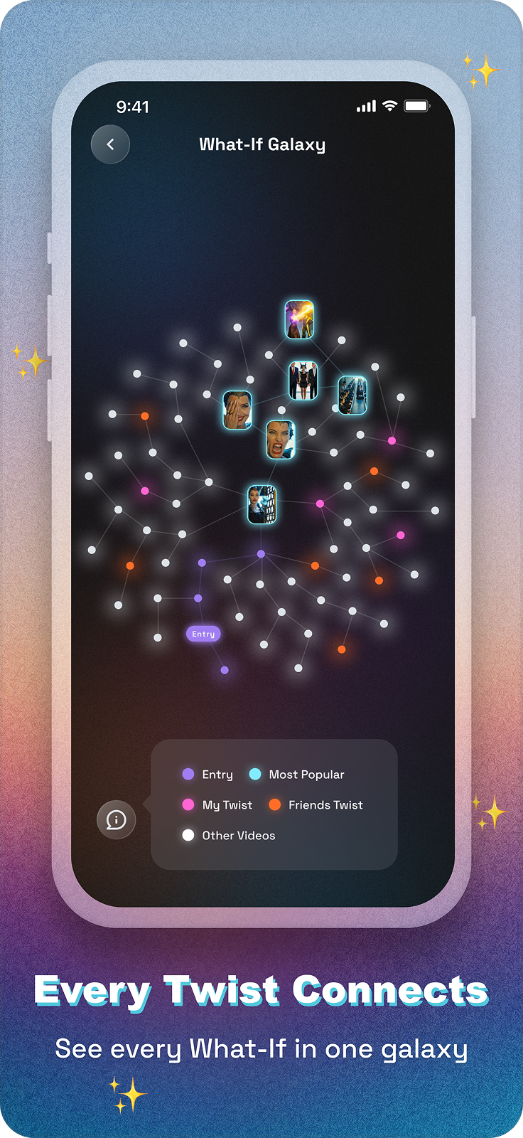
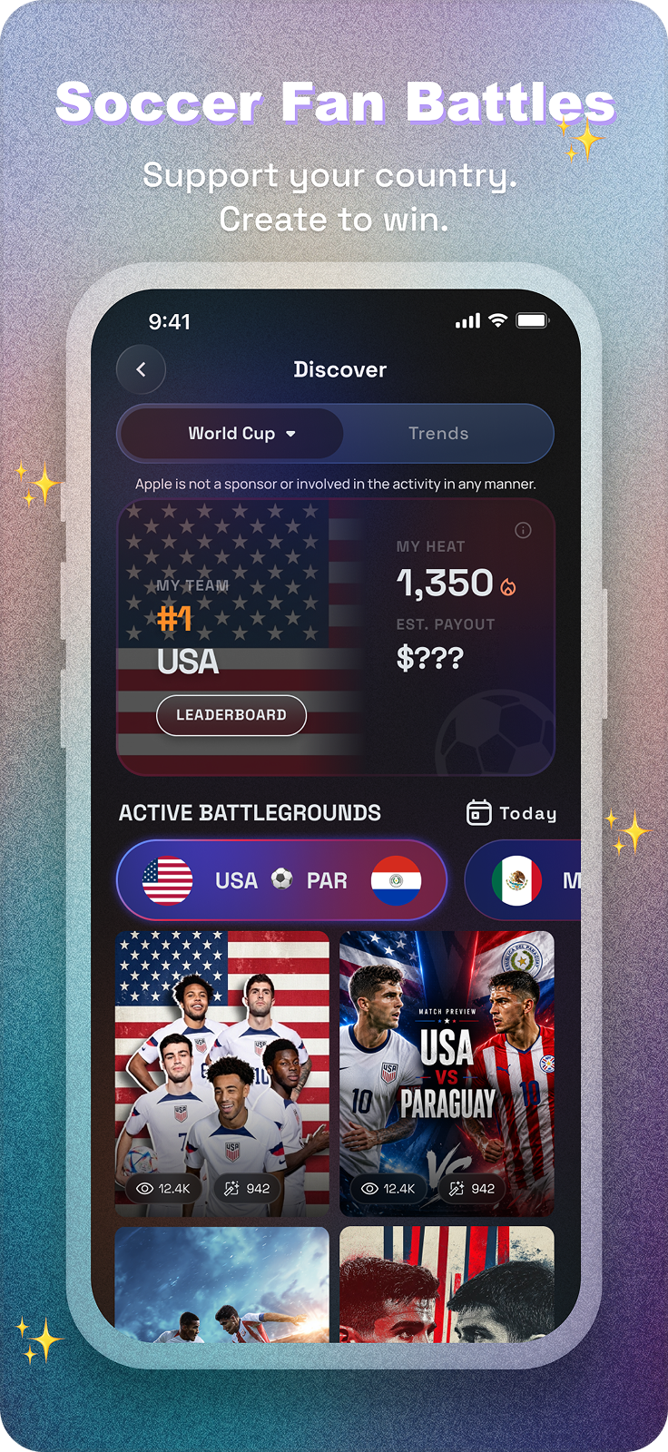
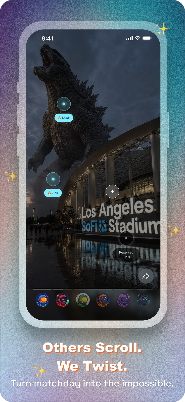
Product details for Wapoo on app store
I joined Wapoo as a product design intern, where I was given two main projects: revamping the app’s overall UI, and designing the interface for the World Cup Fan War. You can click here to jump directly to the second section of this case study.
Context
Wapoo’s visual style needed a redirection.
Wapoo’s MVP leaned into a bold, playful visual style to match Gen Alpha’s internet culture, but the result felt too busy and unpolished. I led a revamp of the app’s UI to strike a better balance between that energy and visual clarity.
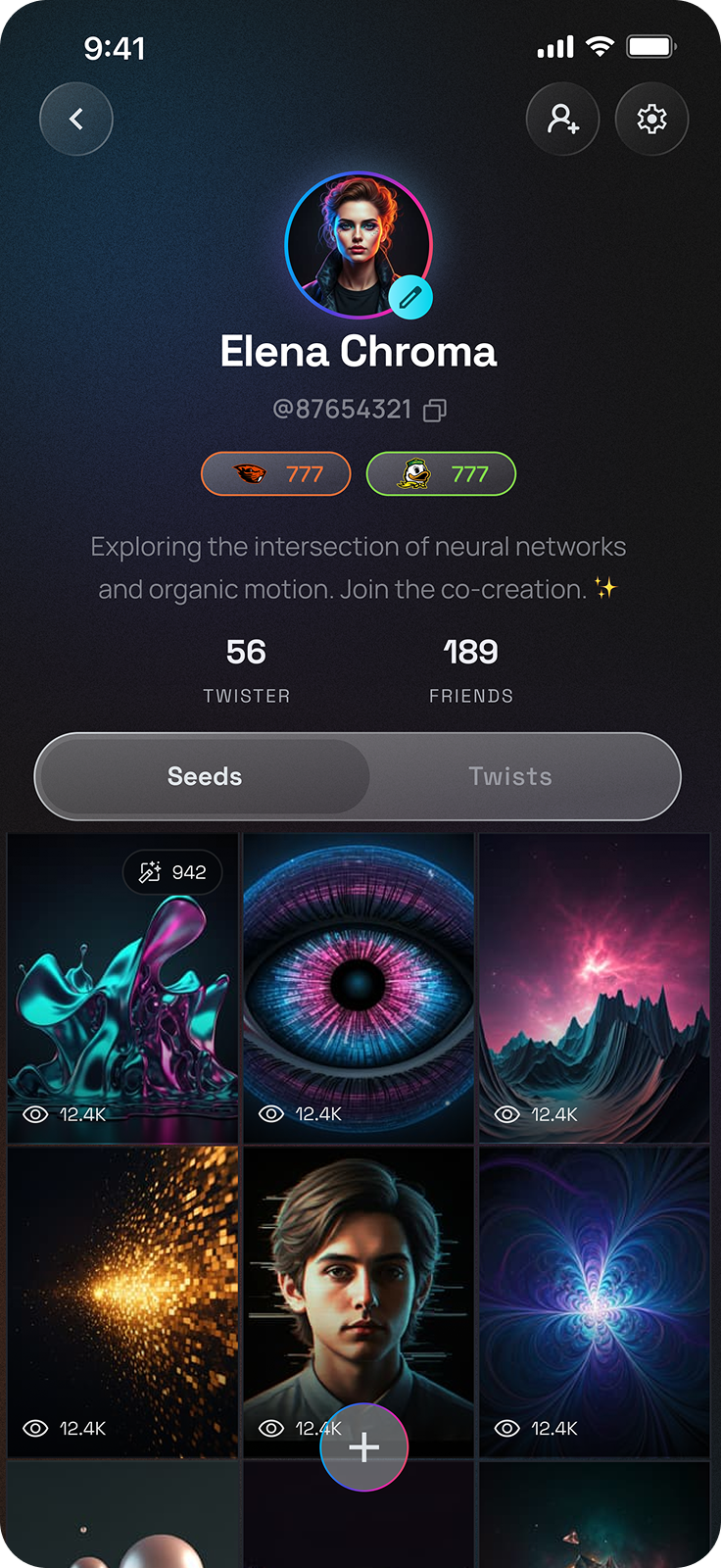
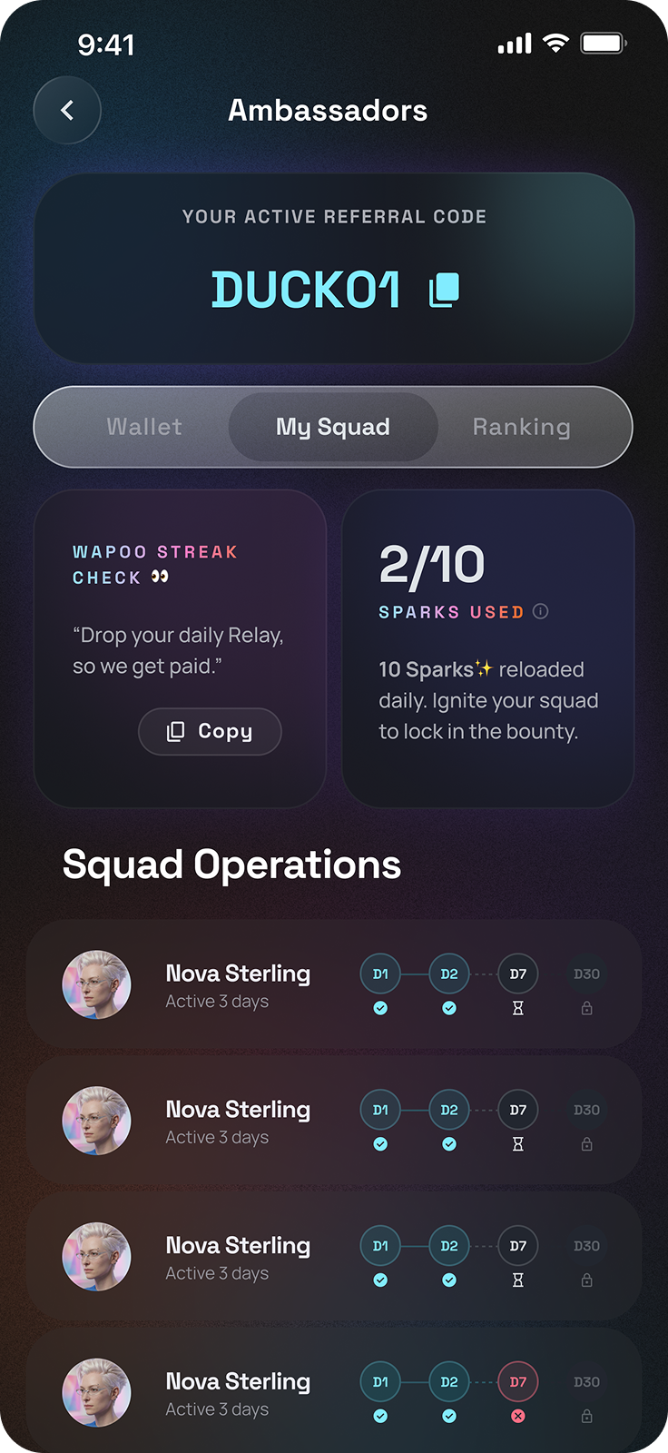
How might we revamp Wapoo’s UI to keep its playful, Gen Alpha energy while making the experience feel cleaner and more polished?
Competitor & secondary research
I reviewed 4 apps that had a similar visual style and audience.
After competitor research, I also reviewed early internal research on Gen Alpha’s UI preferences. A cleaner, pastel interface outperformed the boldest option, indicating that Gen Alpha doesn’t necessarily prefer maximalist design and still need something clean and refined.

Bump
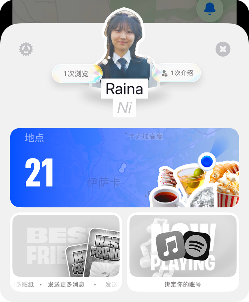
Profile page on Bump
A consistent, recognizable style prevents a product from looking cheap.
ForReal
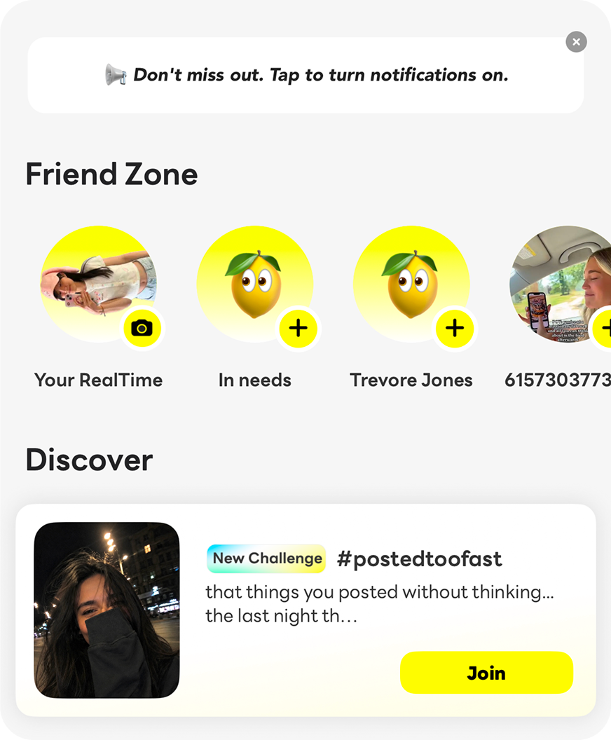
Home page on ForReal
Express the Gen Alpha style through components instead of large gradients across the screens.

TikTok
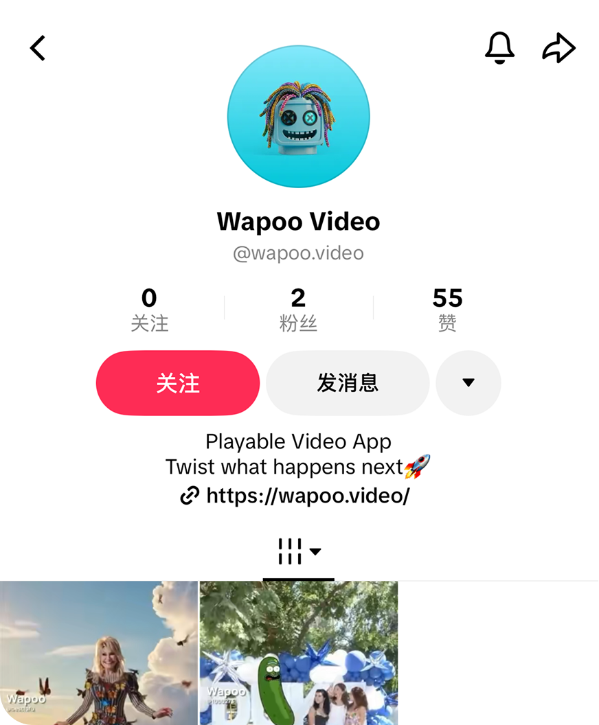
Profile page on TikTok
Clear hierarchy matters even more when the aesthetic is already bold and playful.

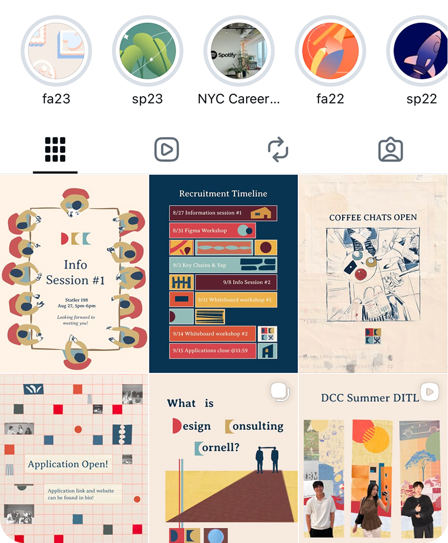
Profile page on Instagram
Reduce color and highlights in the interface itself on media-heavy pages.
Design decisions
I first defined a few requirements the new UI needed to meet.
Primary color: Blue

Since the logo remains unchanged, the primary color had to stay some form of blue for visual consistency.
Incorporate 3D elements

Since the logo itself is 3D, I aimed to bring 3D elements into the UI as well.
All designs should feel playful

Every redesign had to keep that energy front and center, since this quirky energy is core to Wapoo’s identity.
Some designs should feel futuristic

As a nice-to-have, I explored futuristic themes in my designs, given that Wapoo is an AI product.
Redesigns
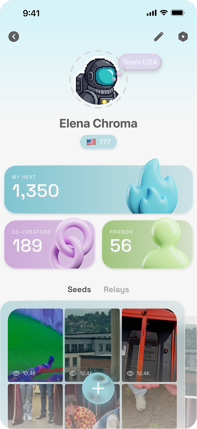
Redesign 1 - Soft Neon
With my first redesign, I wanted to explore a direction that was clean but still playful, since our previous design had leaned too chaotic. I also experimented 3D elements in the UI to correspond with our 3D logo.
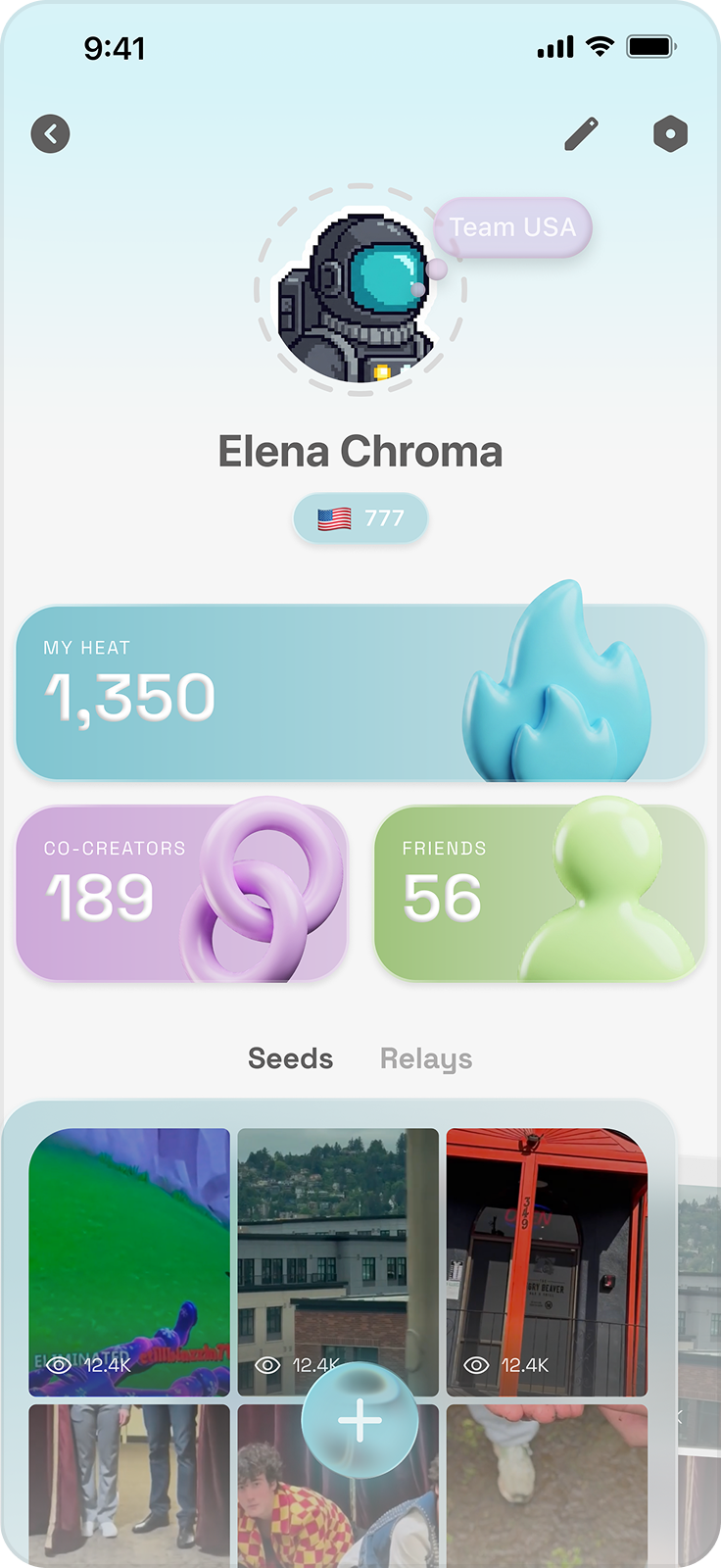
Redesign 1 - Profile page
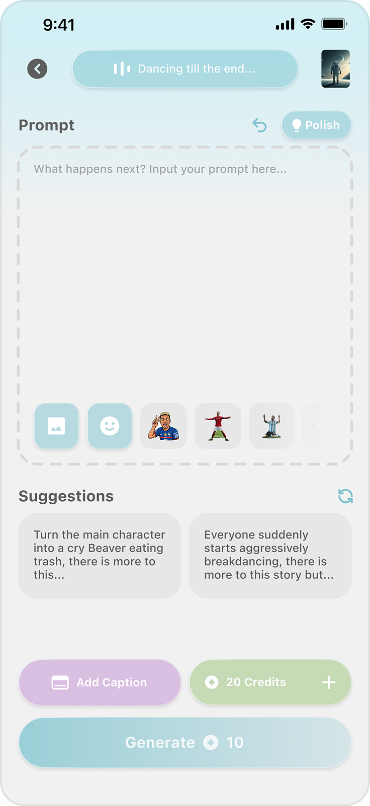
Redesign 1 - Editor page
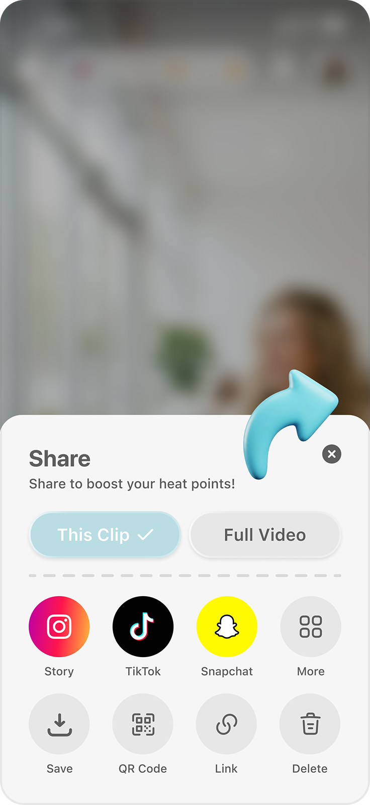
Redesign 1 - Share page
Clean light-blue base, with playful details (bubbles, 3D figures, dashed lines)
Overlapping cards for the video gallery — playfulness expressed through layout, not just decoration.
I turned profile stats from plain numbers into individual decorated cards, where the branding can be showcased.
Reused UI elements and color palette make the style feel consistent.
Purple and green kept minimal in screens to avoid visual chaos.
Explorations
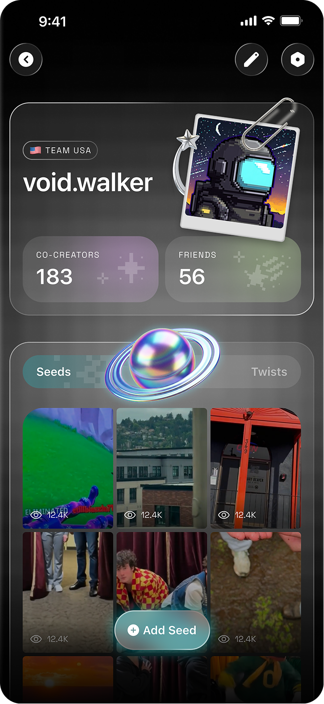
Redesign 2 — Dark Neon
Explorations
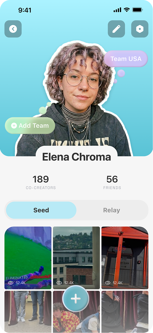
Redesign 3 — Flat Pop
Explorations
Redesign 4 — Cyber Pop
The team chose the 4th redesign (Cyber Pop) as the final direction.
Applied Work
I helped design 6 interfaces for Wapoo's World Cup Fan Wave event.
Screen Detail
Onboarding Flow
Screen Detail
Team Card
Screen Detail
Trending Videos
Screen Detail
Video Gallery
Final Designs